")
Watercolours
By Michael Harding
Watercolours
By Michael Harding
Artists know and appreciate my oil paints for their high pigment load, now watercolourists everywhere will benefit from the unprecedented proportions of pigment in my watercolours.
After forty years making paint and receiving countless requests, I take great pride in launching a range of 135 finely ground watercolours. These watercolours will amaze with their colour strength, vibrance, clarity, and longevity!

Reviews
– Marlaine Michie –
“I love using MH paints because they are a unique and quality brand. With the single stroke of a brush, the magic of colour unfolds on the page. And so much colour! I find it such a joy to use these watercolours because they were made for the artist by an artist. With the high pigmentation load, I can choose to paint vibrant colours or have the freedom to tone things down. Every painting has become an adventure.
I discovered these paints through the Italian Art Shop in Cape Town, when I was asked if I would test a few colours. When Michael Harding asked me to test the whole range, I agreed without hesitation, and so the unexpected journey began!
I am passionate about paint and colour, so I really enjoyed discovering this brand and mixing the colours, and watching how they behave on paper. It never gets old for me!
During the testing process, I found myself reaching for MH paints in my personal painting, too, as I discovered and learnt about each colour in the range. I then soon realised they were becoming ‘my brand’. I use them for illustrations in my journals, as well as for painting anything from birds and flowers to landscapes.
This brand has a range of colours to suit every watercolour artist out there!”
– Poppy Balser –
“I am delighted with the brilliancy of the pigments and the range of colours available in Michael’s new watercolour line. The colours mix cleanly whether mixed on my paper or on my palette. The squeezed out paint stays fresh and workable for a long time in my palette. That makes it easy to quickly mix up large puddles of paint so that I can keep my washes flowing together, so important when working with watercolours.
I was first tempted to try out Michael Harding’s watercolours because I love his oil paints for their consistency and colour. I had the great good fortune to be awarded a trial set of Michael’s watercolours as part of the “Best Watercolour Award” at the Bermuda Plein Air Festival. Bermuda has a long and rich history as a location for watercolor painters including Winslow Homer, Georgia O’Keefe and Andrew Wyeth.
It was an extremely exciting experience to win a set of Michael’s paints while on the island. I was delighted to find using his watercolours to be every bit as rewarding as using his oil paints. The colours are intense and highly pigmented and I can mix just the shades I need to give my paintings luminosity and depth.
Michael Harding was a painter before he became a paint maker, which he did in order to create a higher quality of paints than he could find elsewhere. It is a pleasure to work with paints made by someone who takes paint-making and paint quality so seriously.”
– Brienne Brown –
“Michael Harding’s watercolours are beautiful paints with powerful colours, and a little can go a long way. The pigment concentration and smooth consistency make these paints easy to reconstitute and get rich, deep colours. Creating high-contrast paintings is important to me, so using Michael Harding’s watercolours in my studio has made this easy. These paints are always ready to go when I am.
Watercolour is my passion. I love the slightly controlled chaos that painting with watercolours can provide. By mixing colours on my palette and on the paper, I allow the pigments to mix and blend in exciting ways. To get a wide range of values, I focus on the pigment-to-water ratio. So, getting enough pigment in my brush is important. If my paint is too dry, it can be hard to get the amount of paint I need without adding fresh paint.
I have been testing and using Michael Harding’s watercolour paints for about three years. The pigment concentration and smooth consistency make these paints easy to reconstitute and get rich, deep colours. Creating high-contrast paintings is important to me, and so using Michael Harding’s watercolours in my studio has made this easy. These paints are always ready to go when I am. It can take a while to get used to the high concentration of pigment in Michael Harding’s paints. However, these highly concentrated paints are a great benefit to how I work in watercolour.
I like to mix colours to get a wide range of slightly chroma-shifted neutrals, and these pigments help me do this without creating mud. These are beautiful paints with powerful colours and a little can go a long way.”
– Nikki Ali –
“I recently purchased your watercolour paints, and I was absolutely blown away. I saw the Jacksons’ Youtube video of how Michael was showing the different colours and how they behaved. I bought 12 tubes and my goodness it’s so difficult not to buy more. After swatching them I was surprised at how silky and thick the paint is though it dances with the water in perfect harmony for light washes.
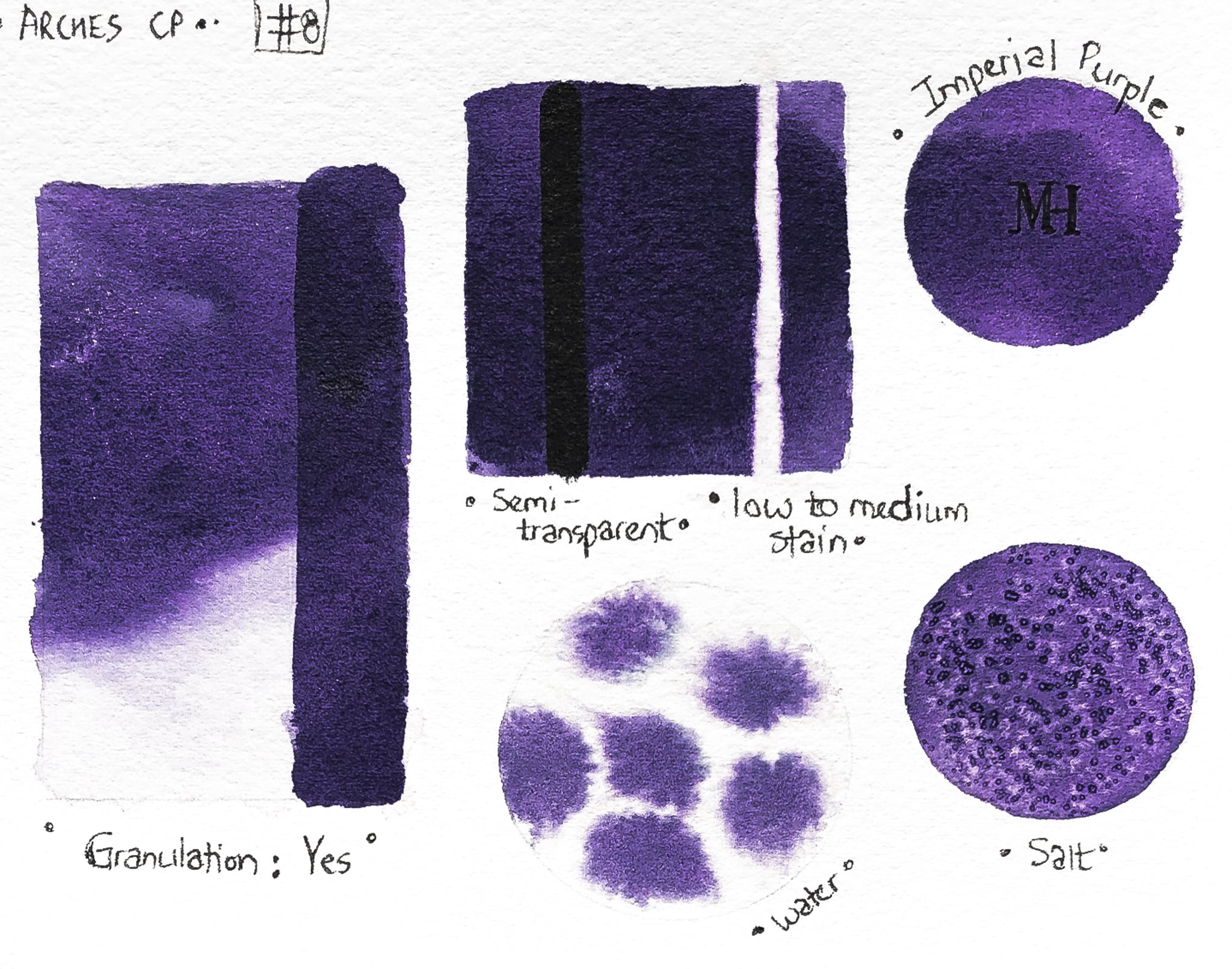
The colour range is amazing, the combinations of colours used in some of the shades granulate beautifully displaying a hidden colour within it. For example, the Imperial Purple, which is my favourite. The paints are so vibrant you do not need many layers at all. I also found the paints lift effortlessly. It’s like painting with silk.
The quality of the paints in my opinion is better than any American or European brand I have used. They are exceptional in quality and vibrancy. Thank you for producing an amazing product.”
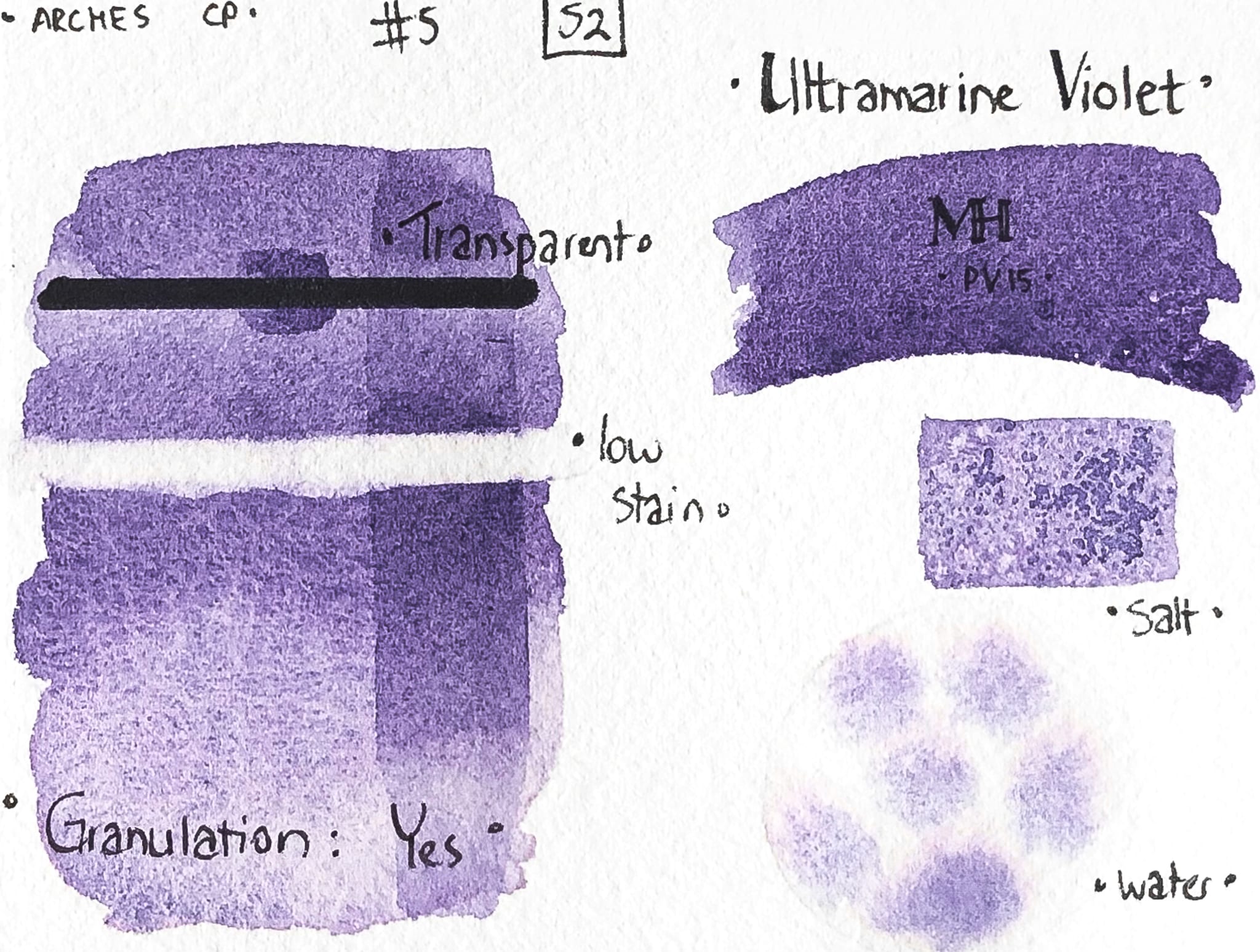
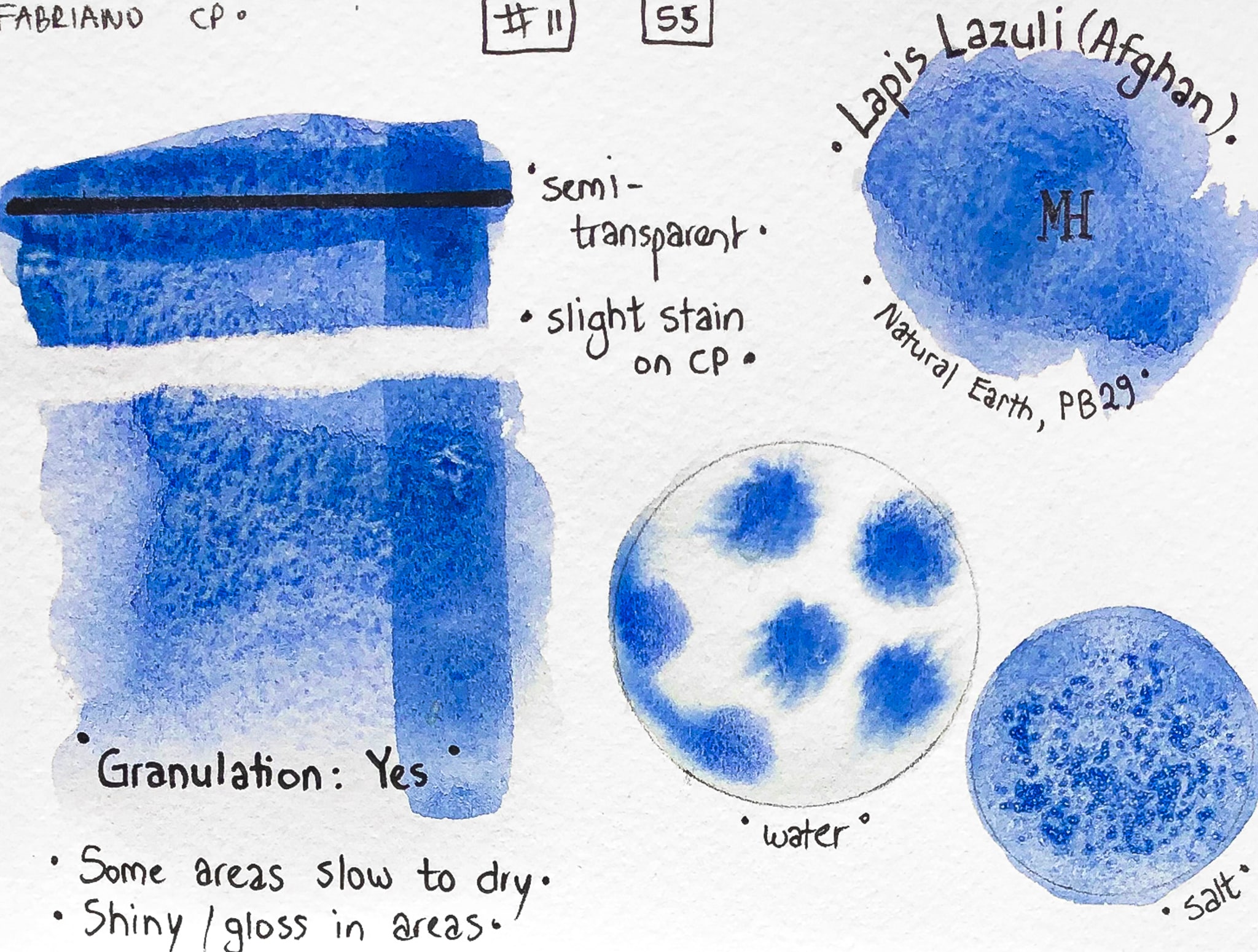
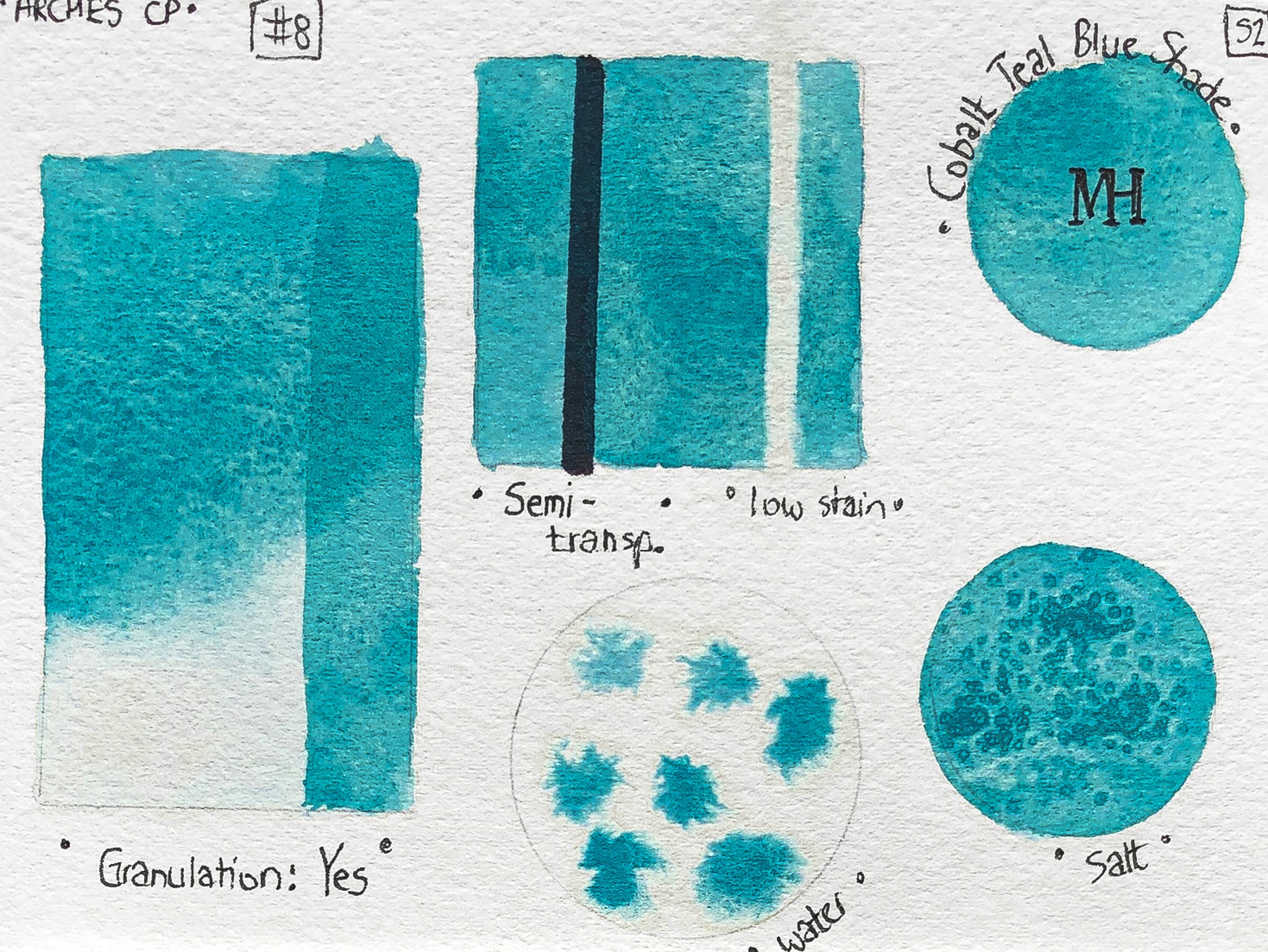
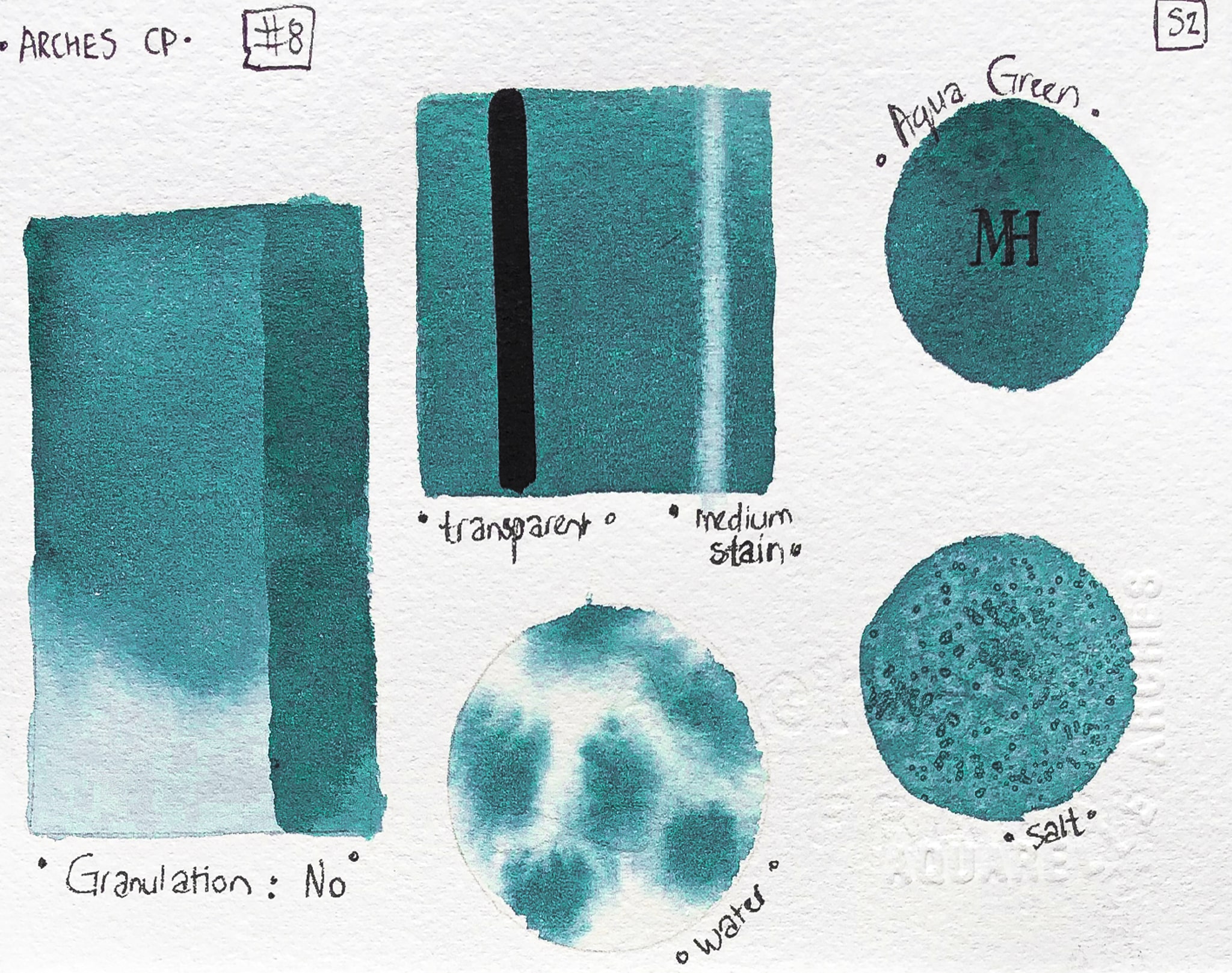
Michael Harding Watercolours
(a review by Marlaine Michie)
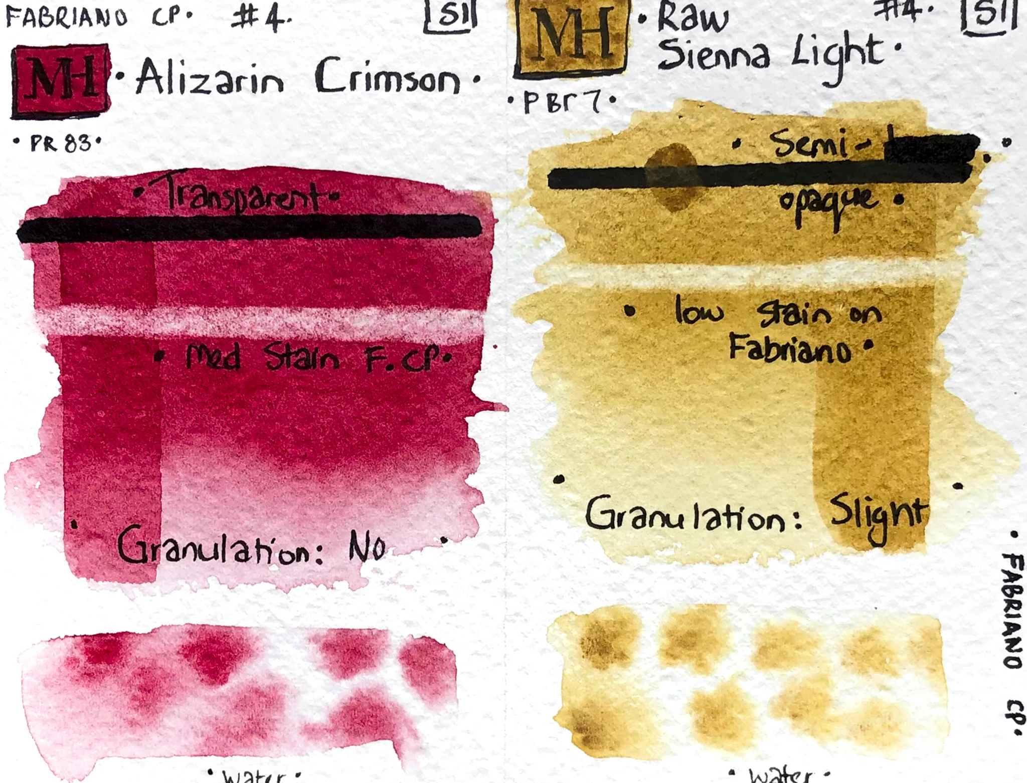
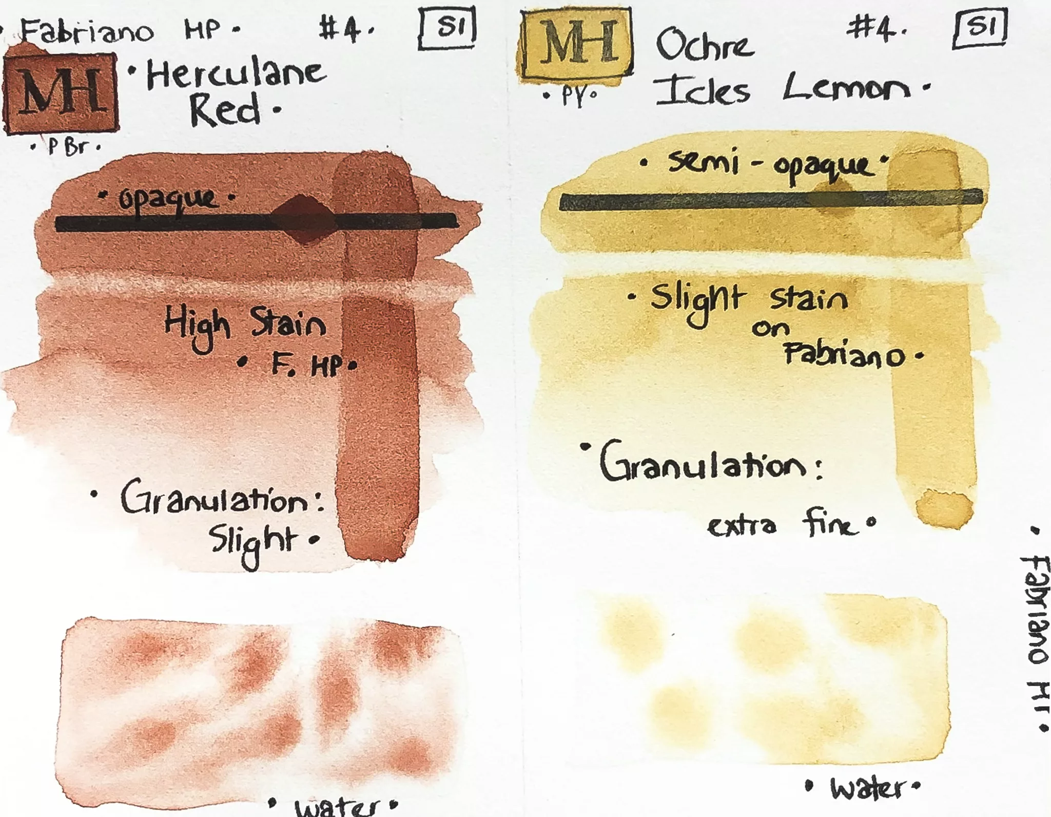
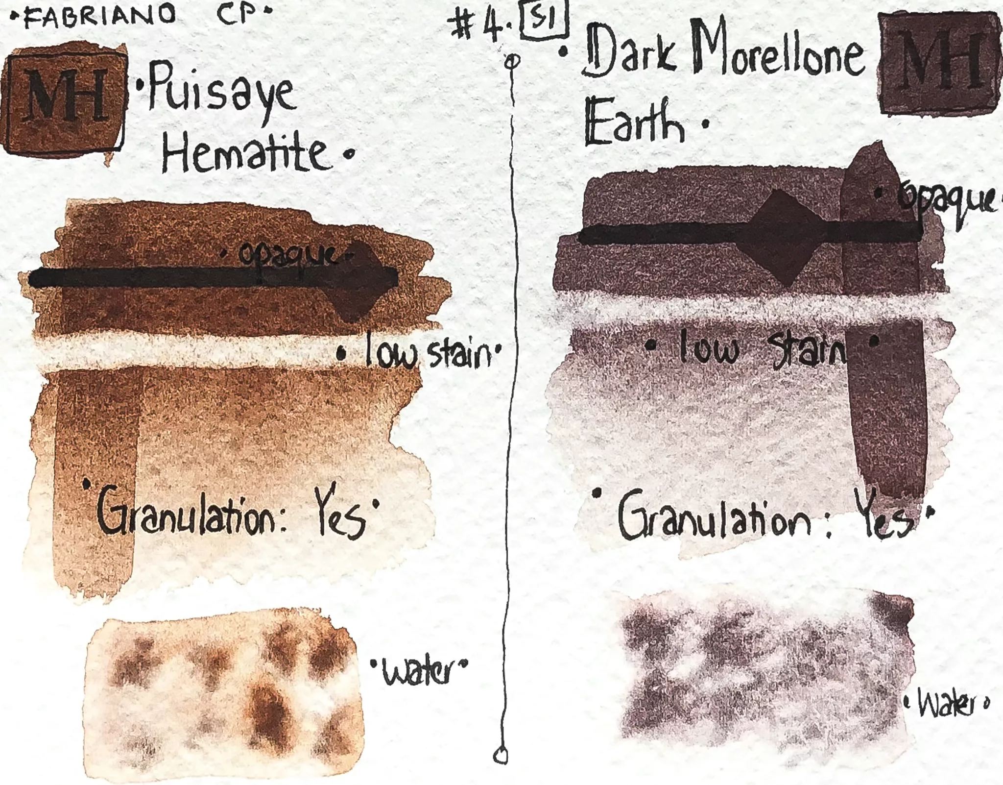
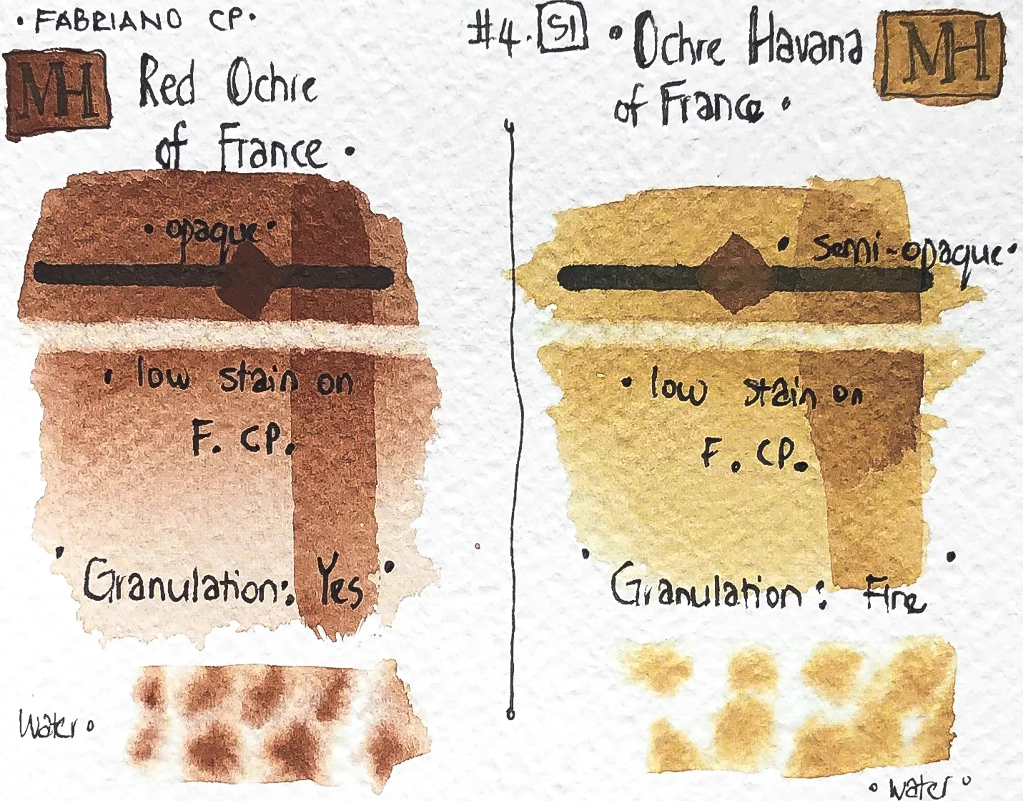
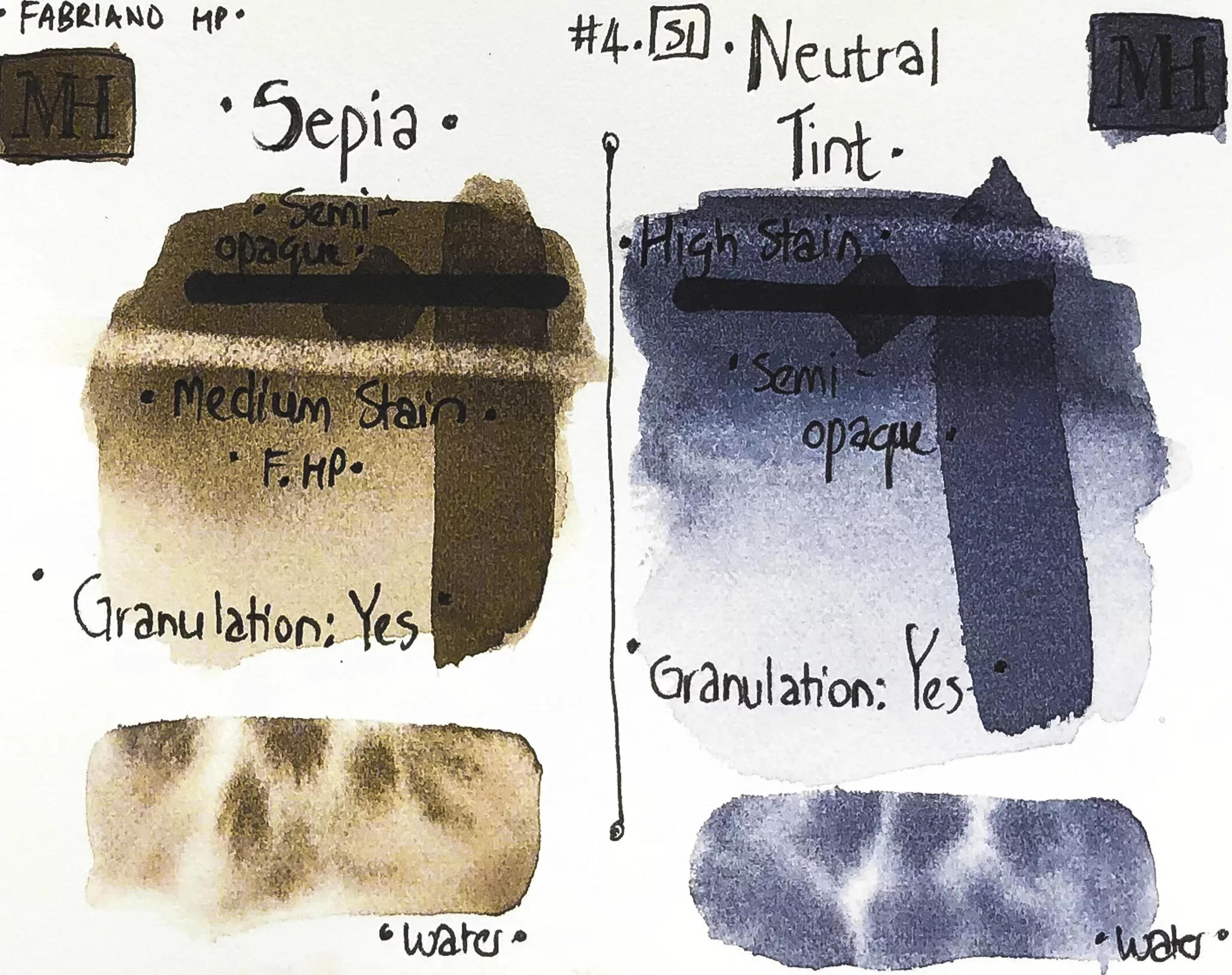
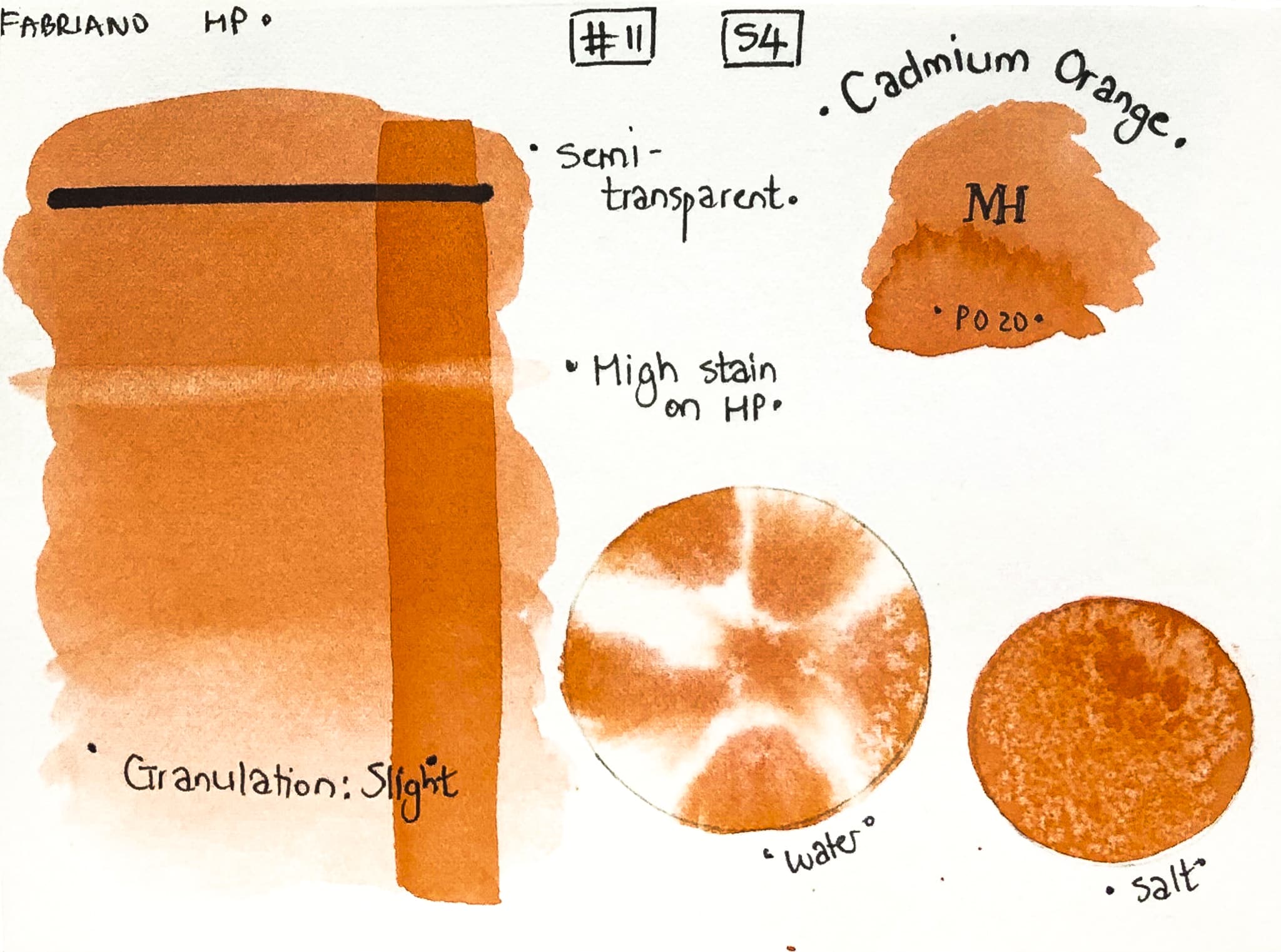
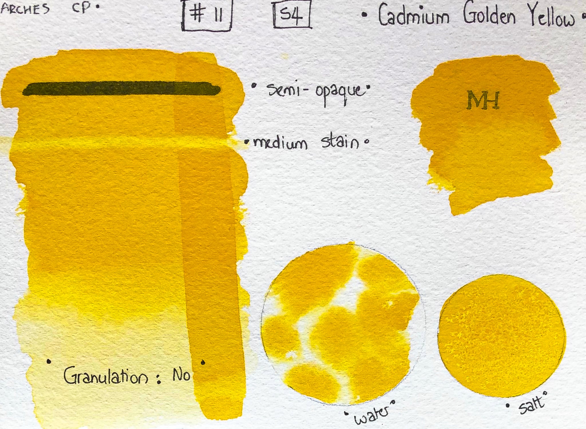
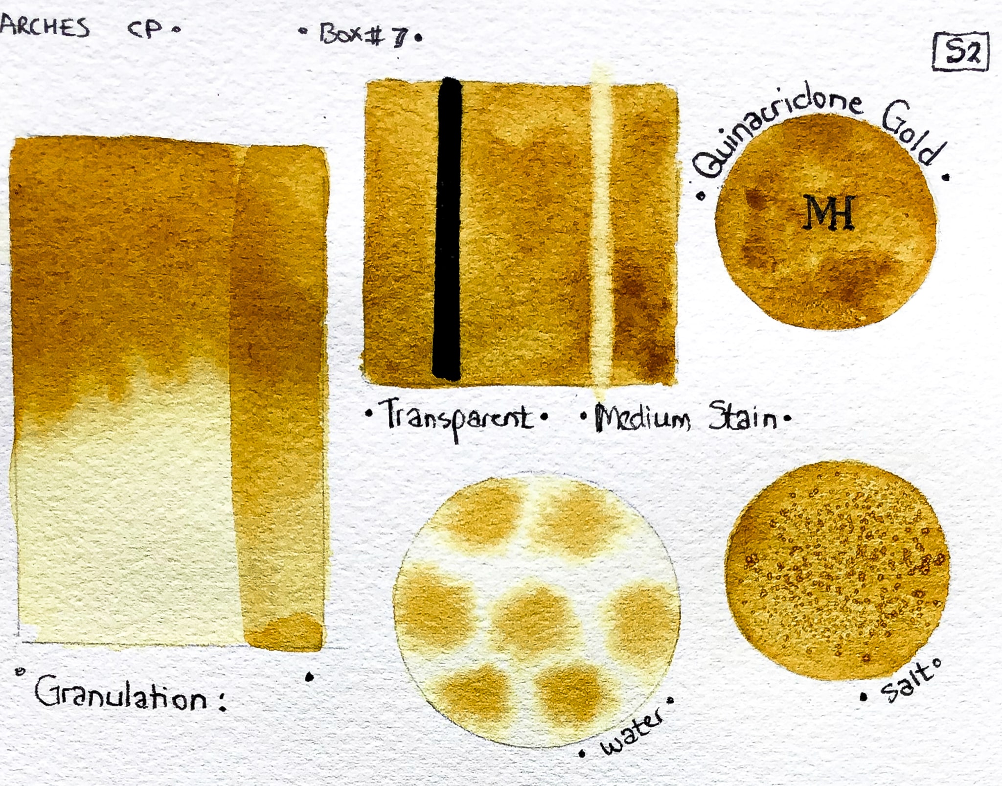
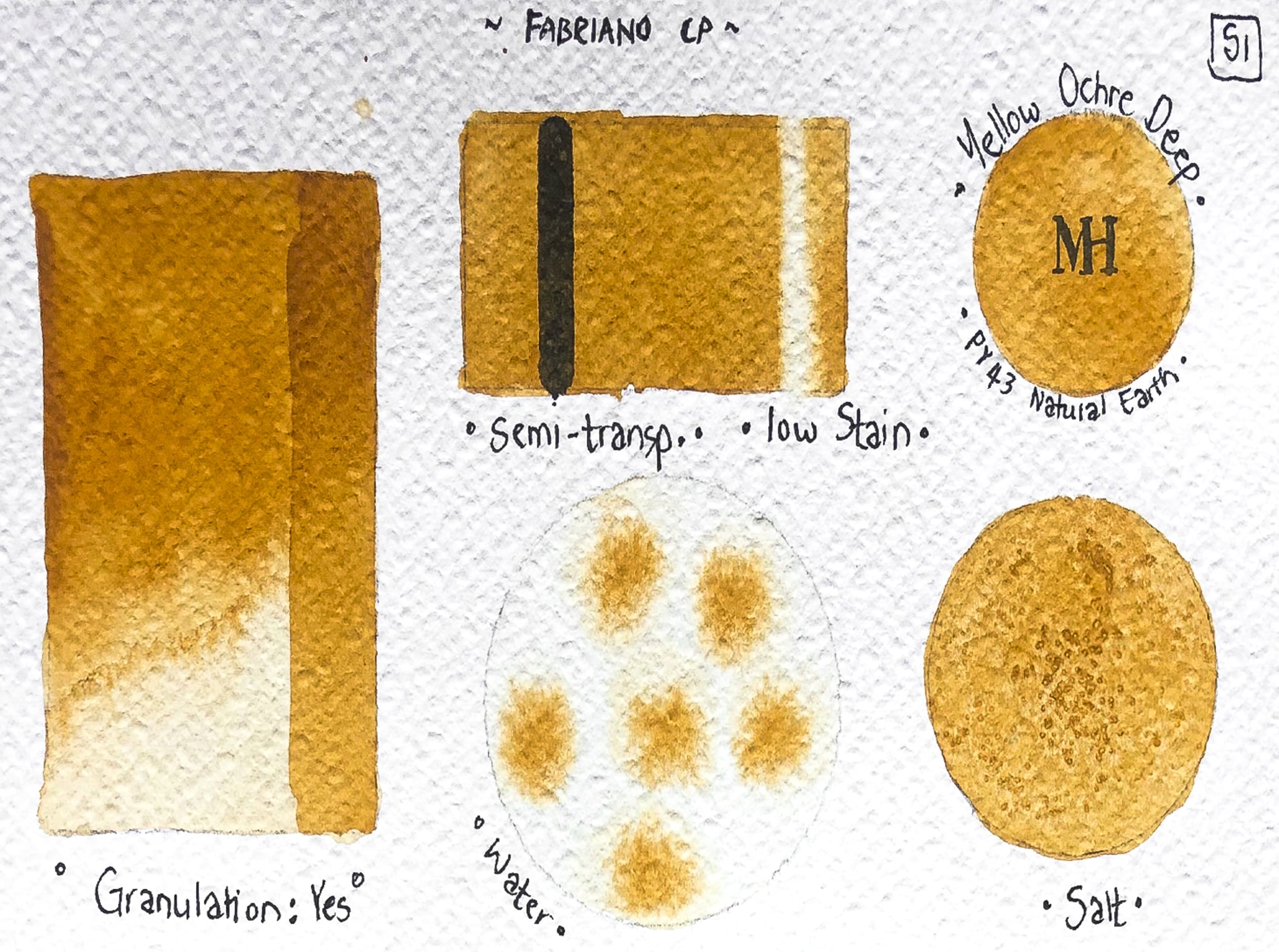
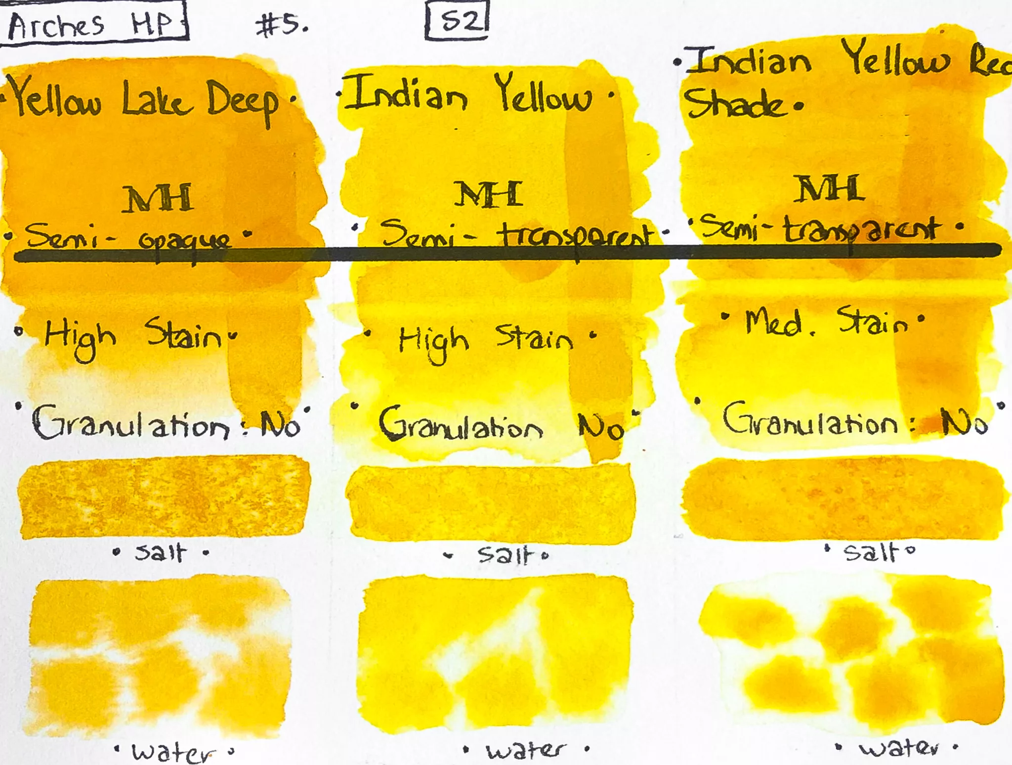
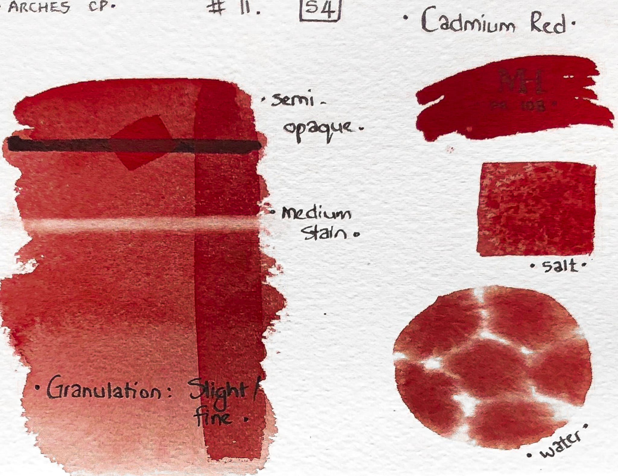
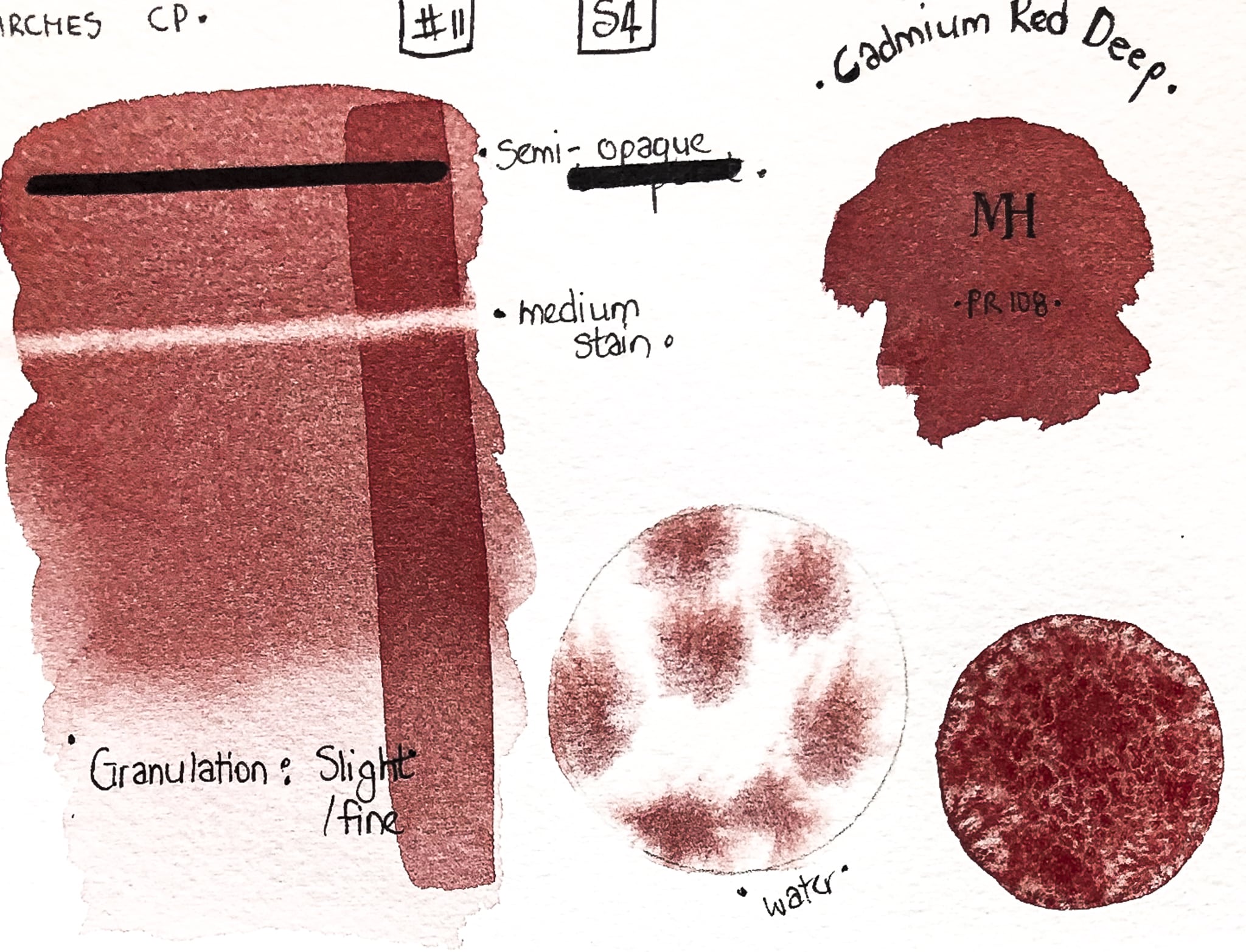
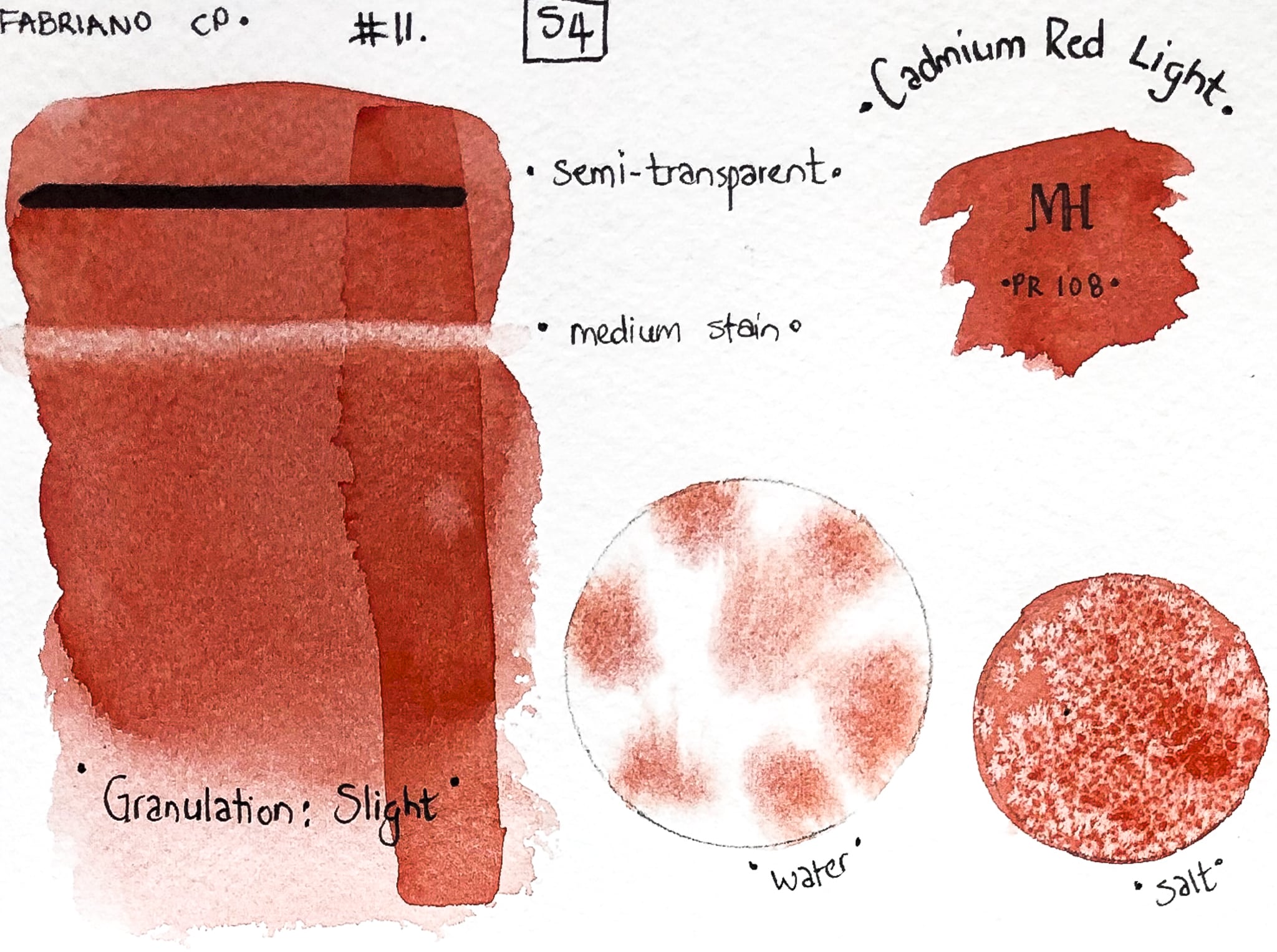
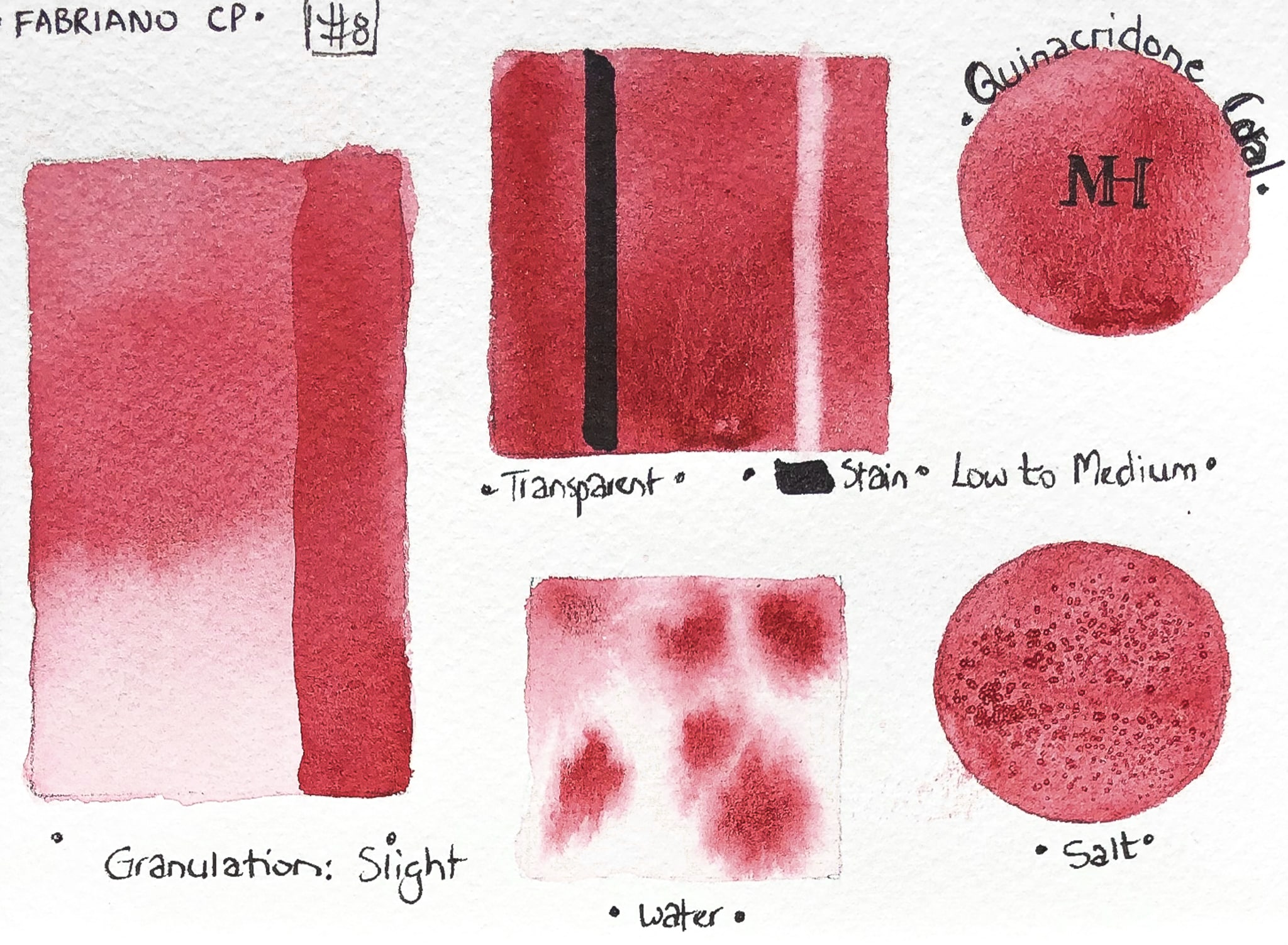
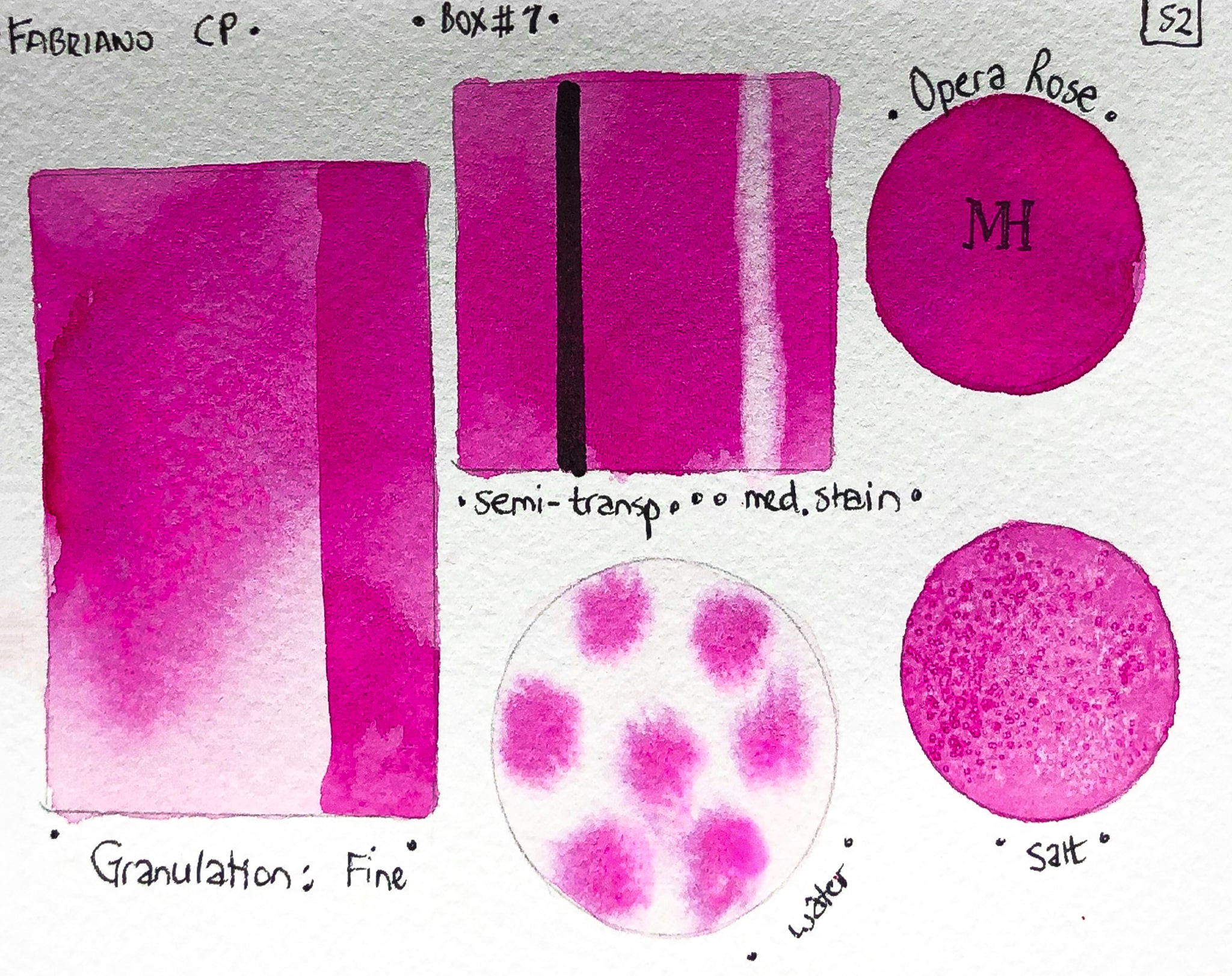
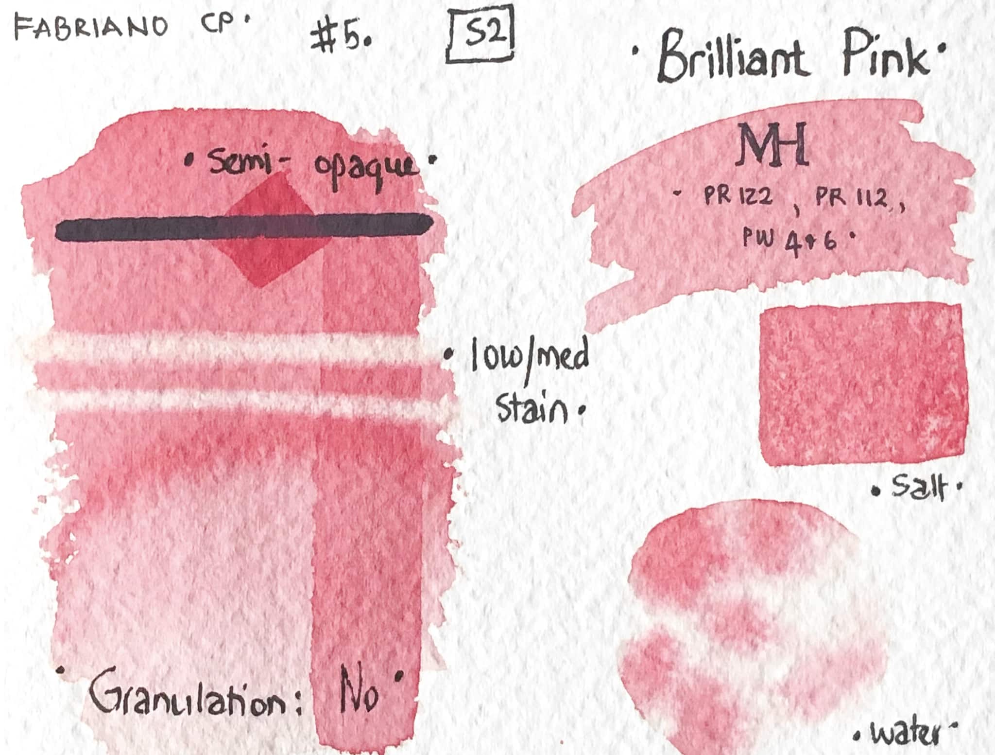
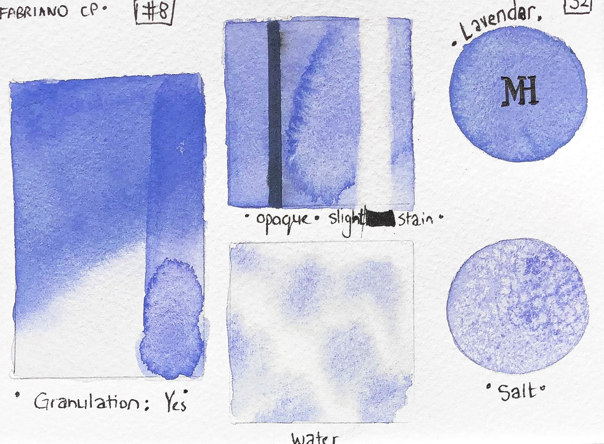
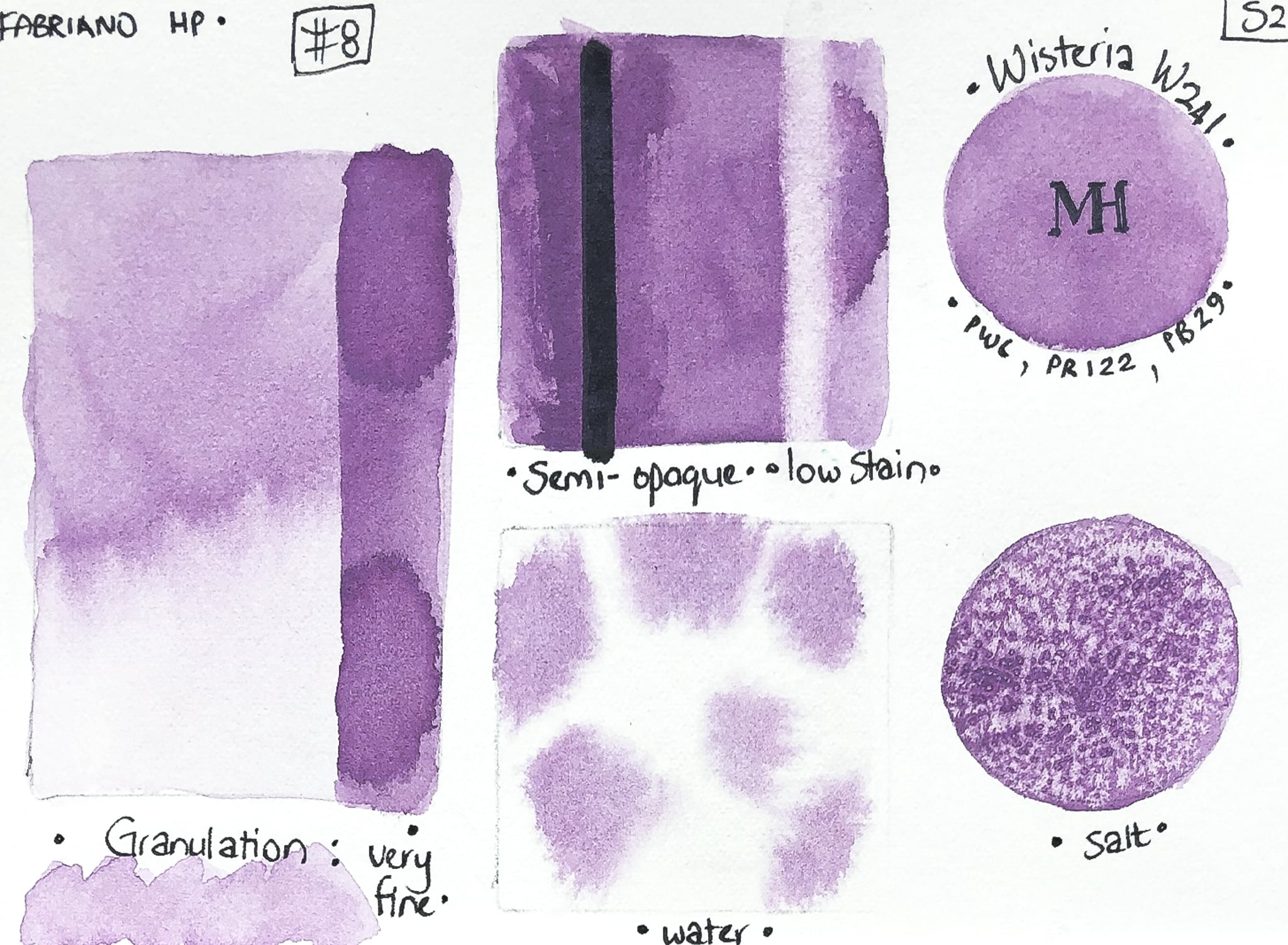
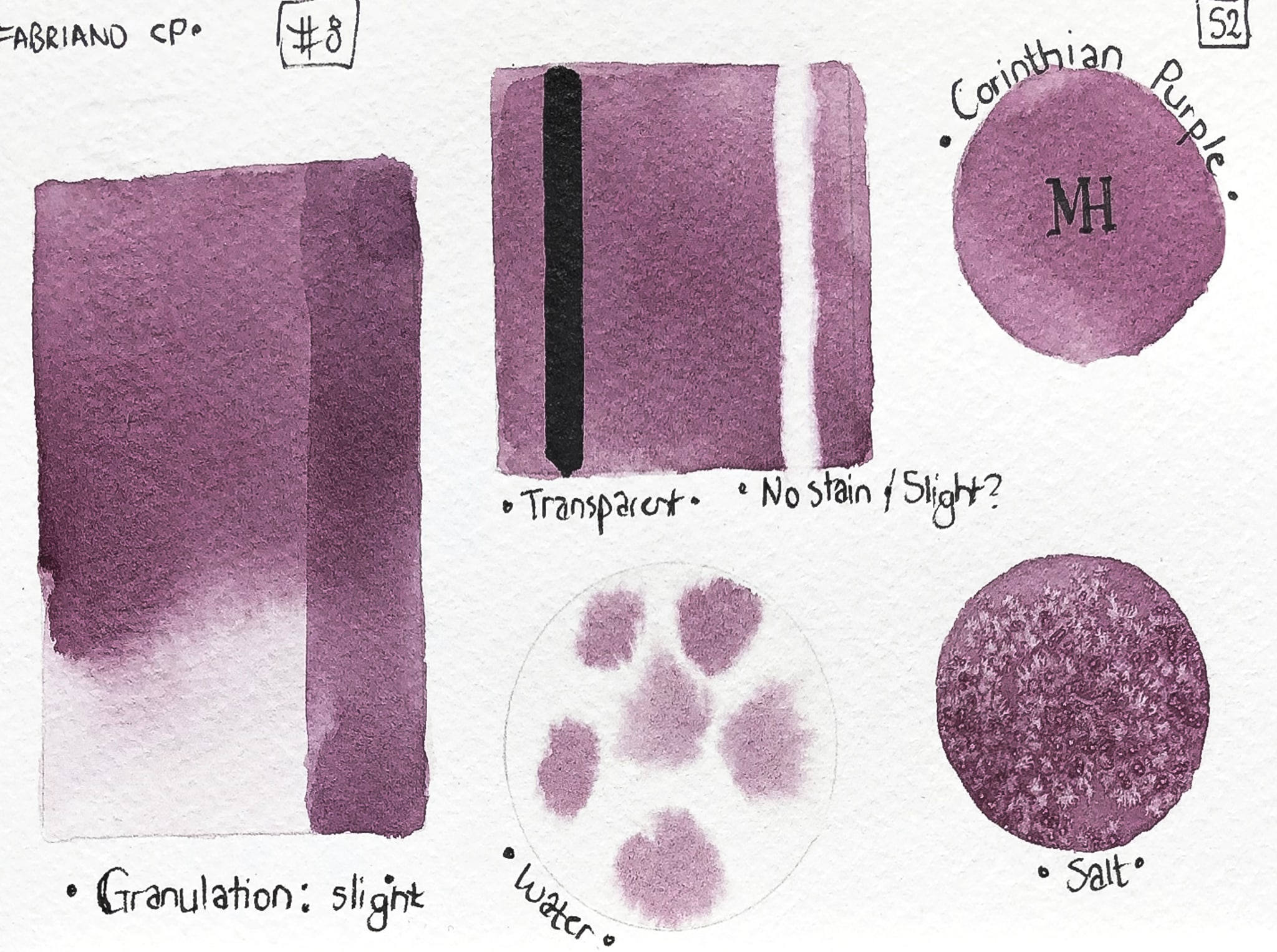
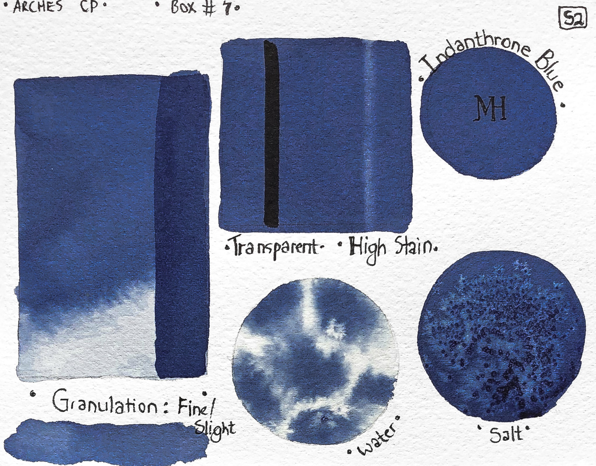
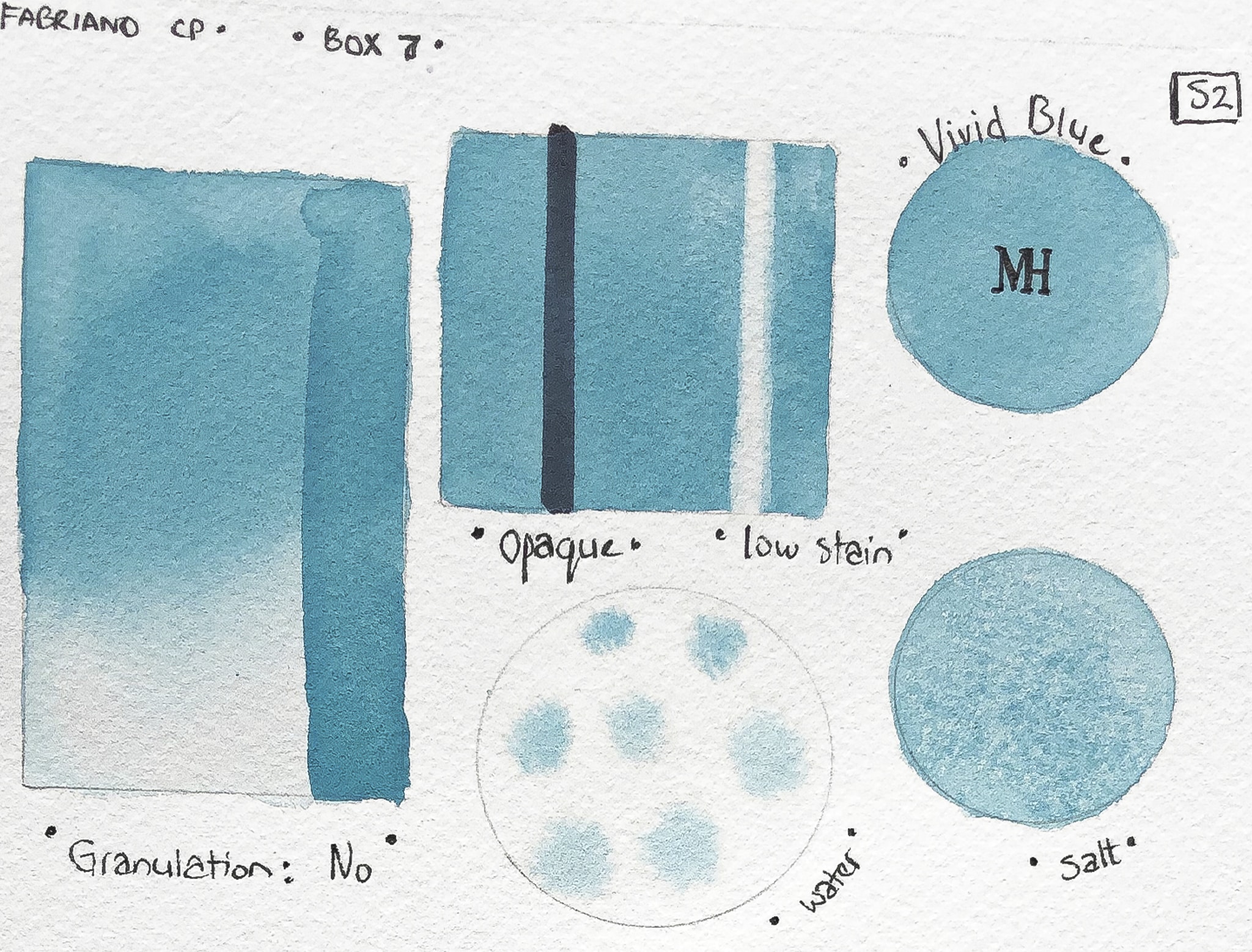
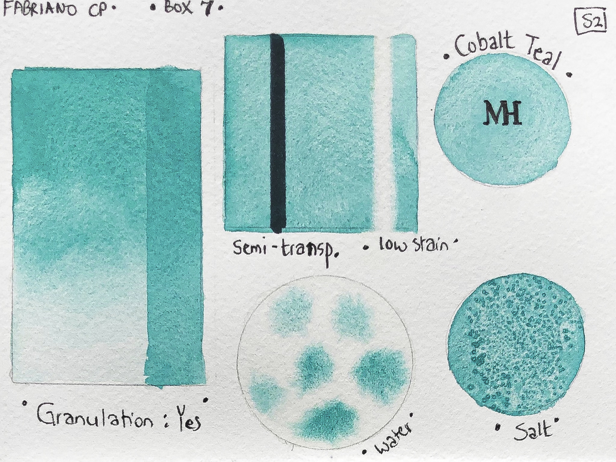
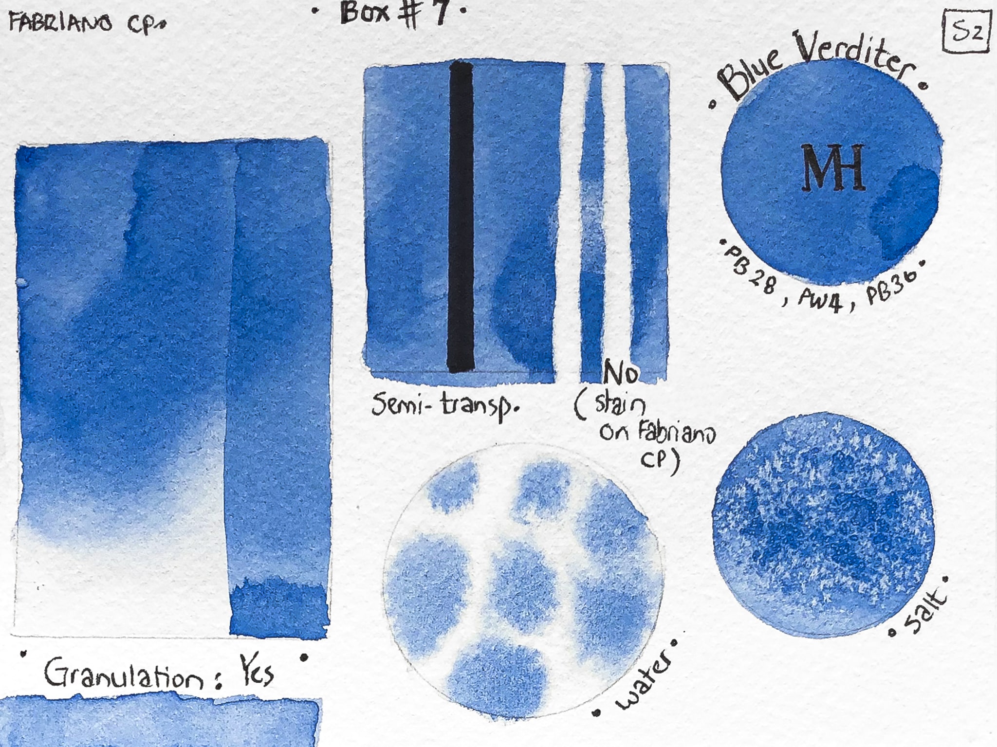
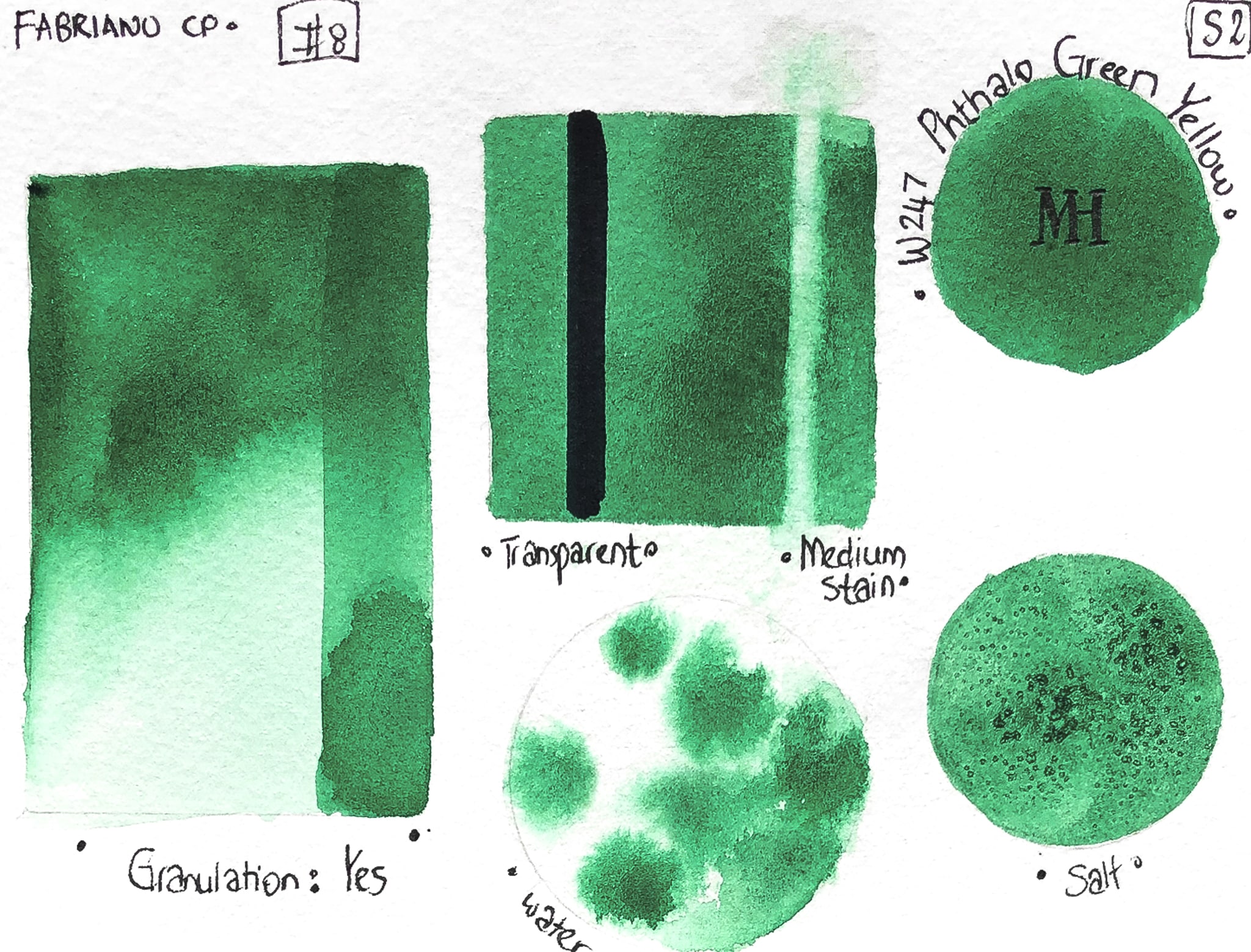
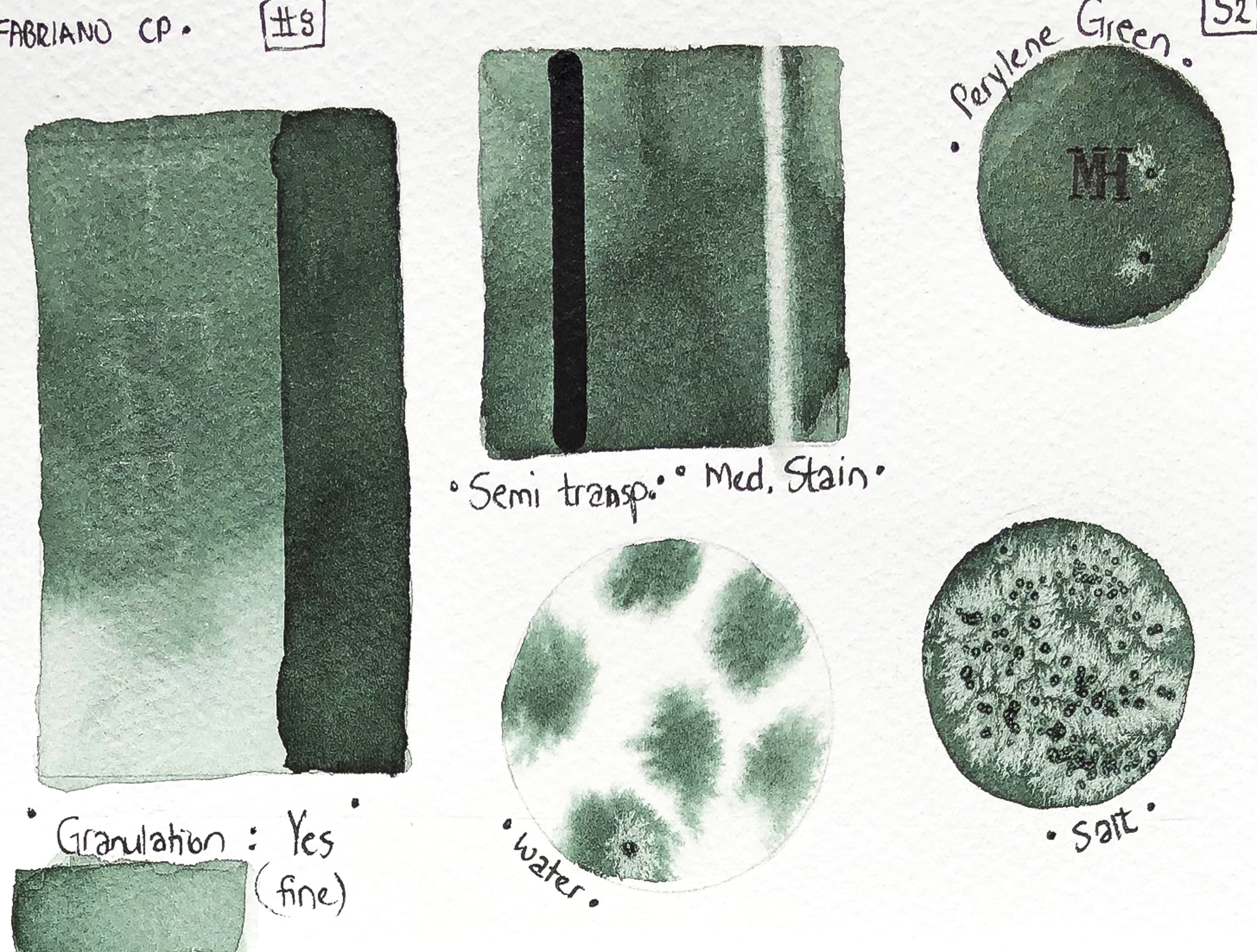
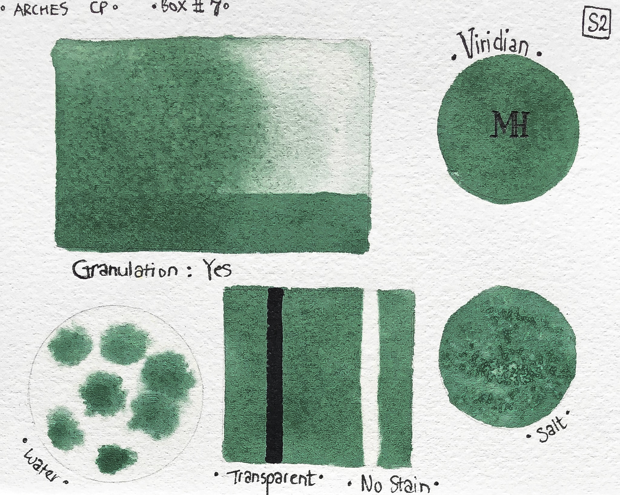
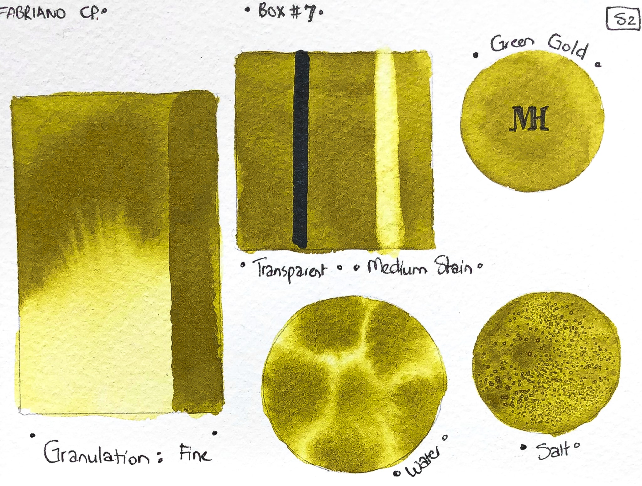
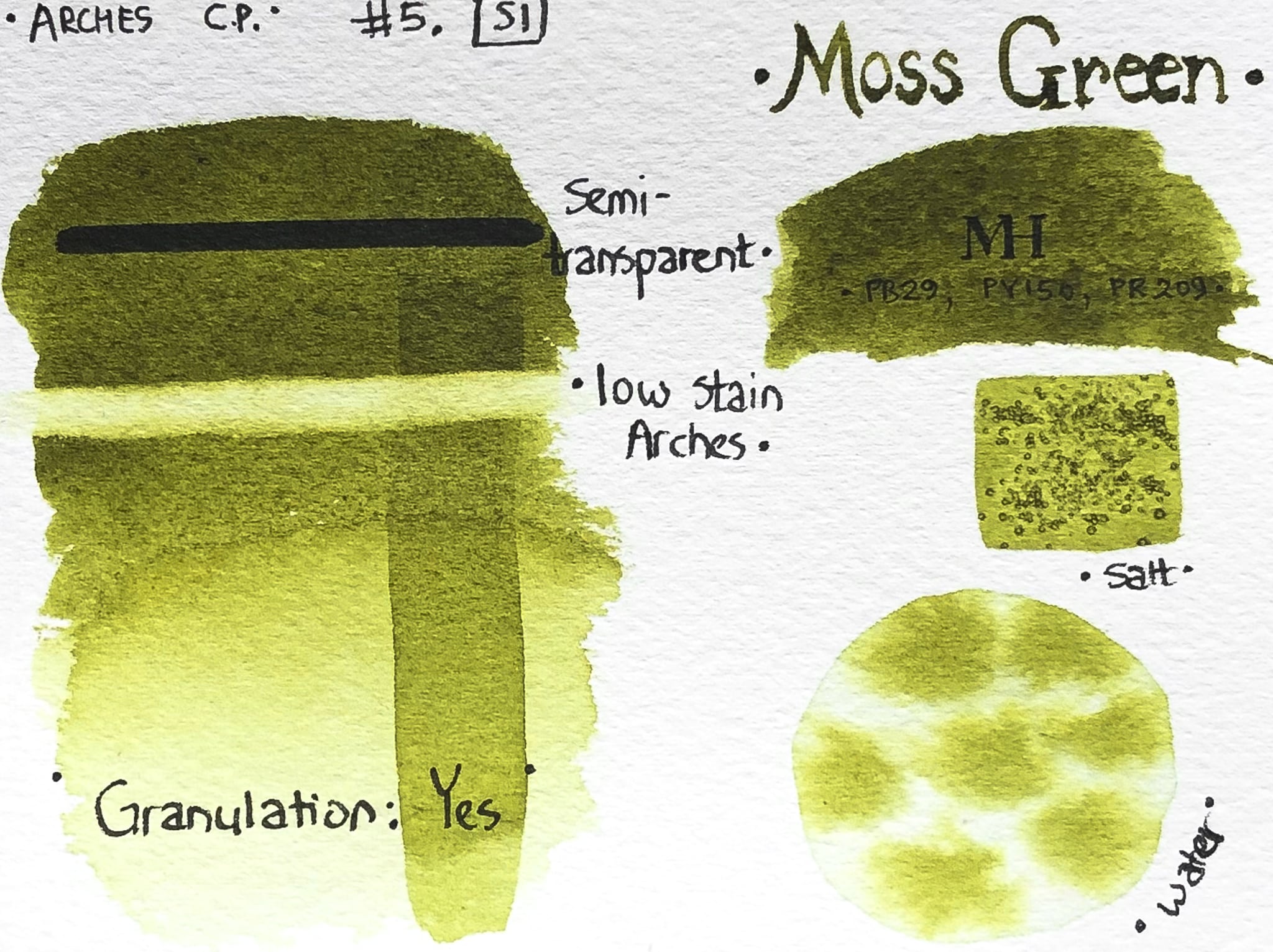
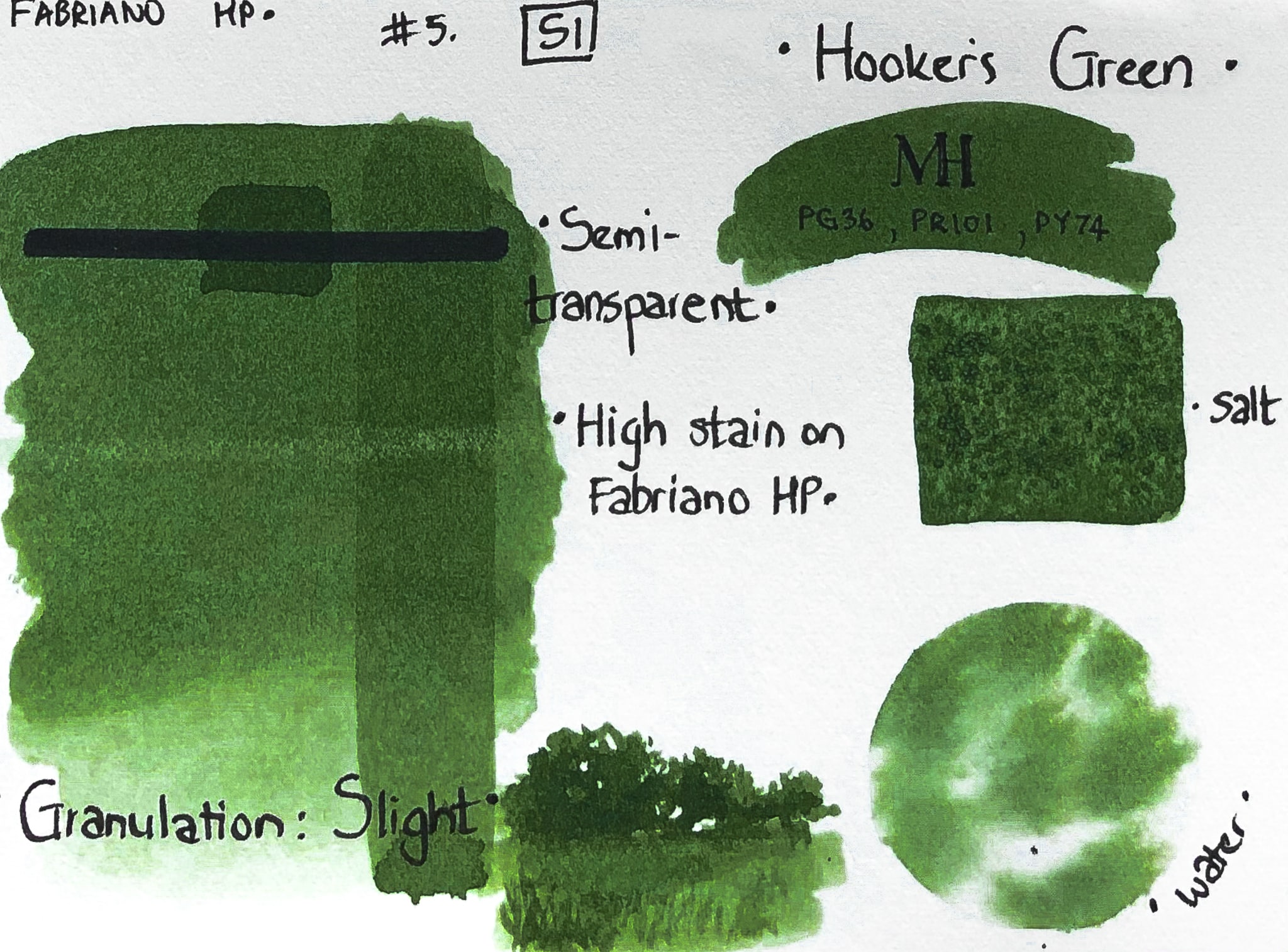
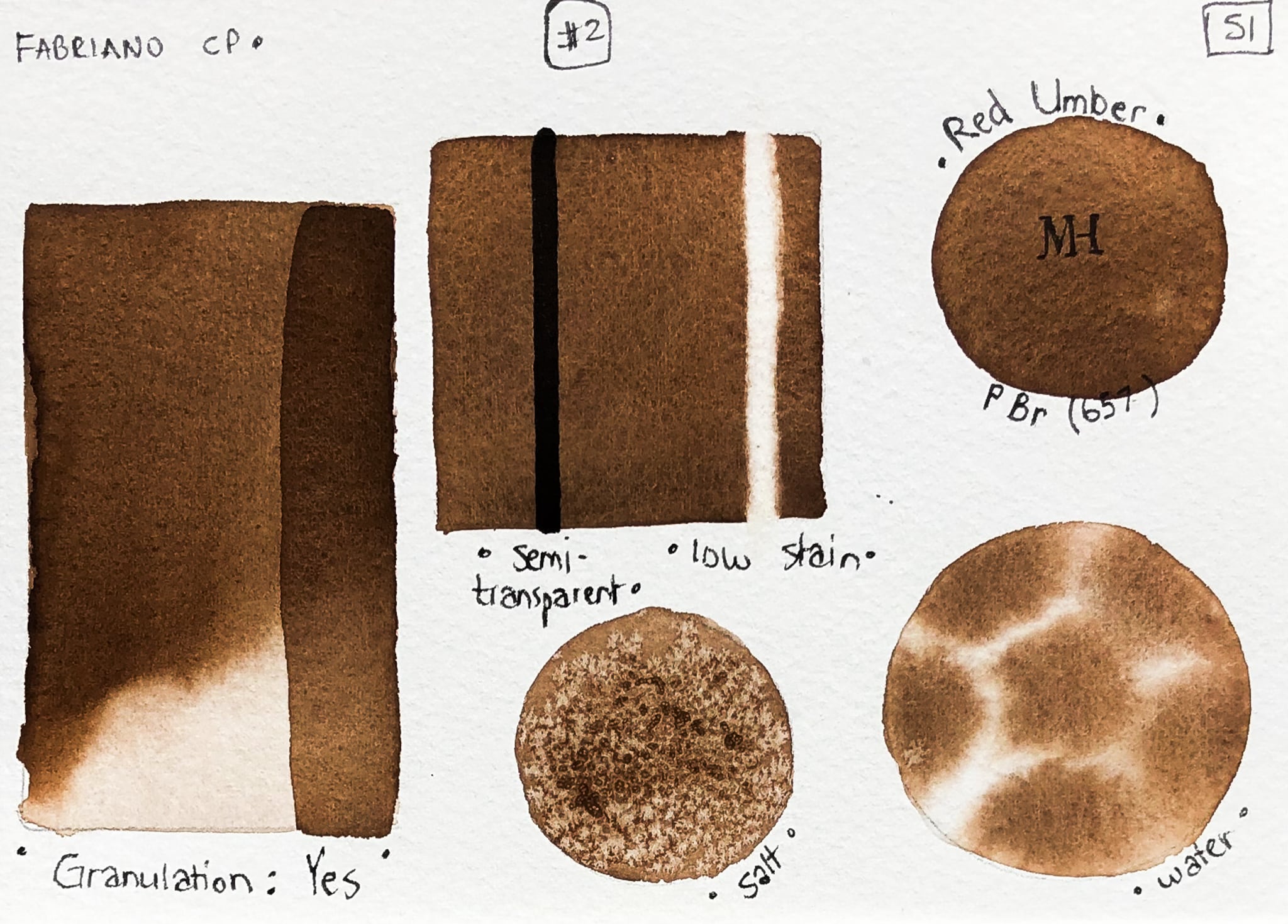
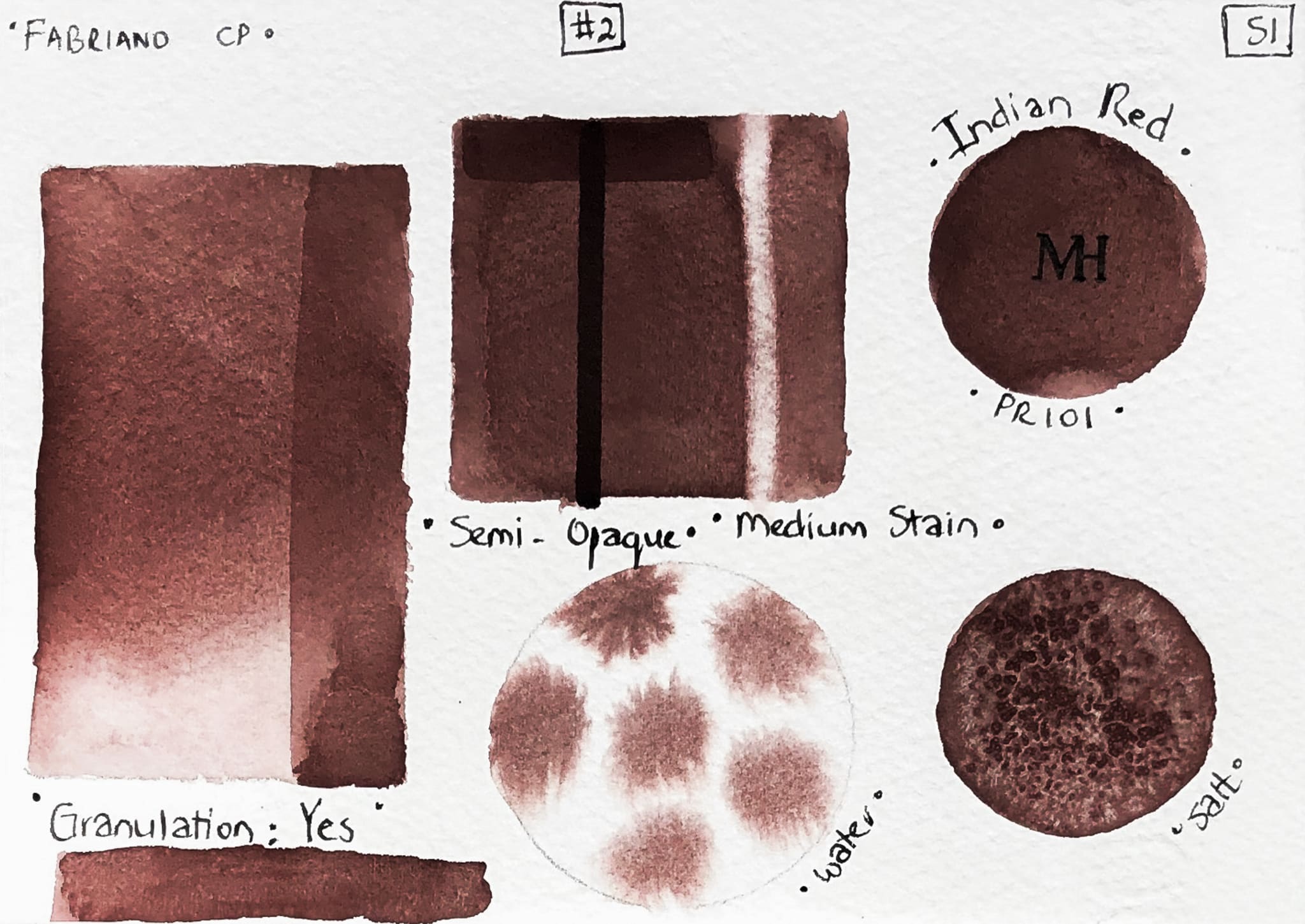
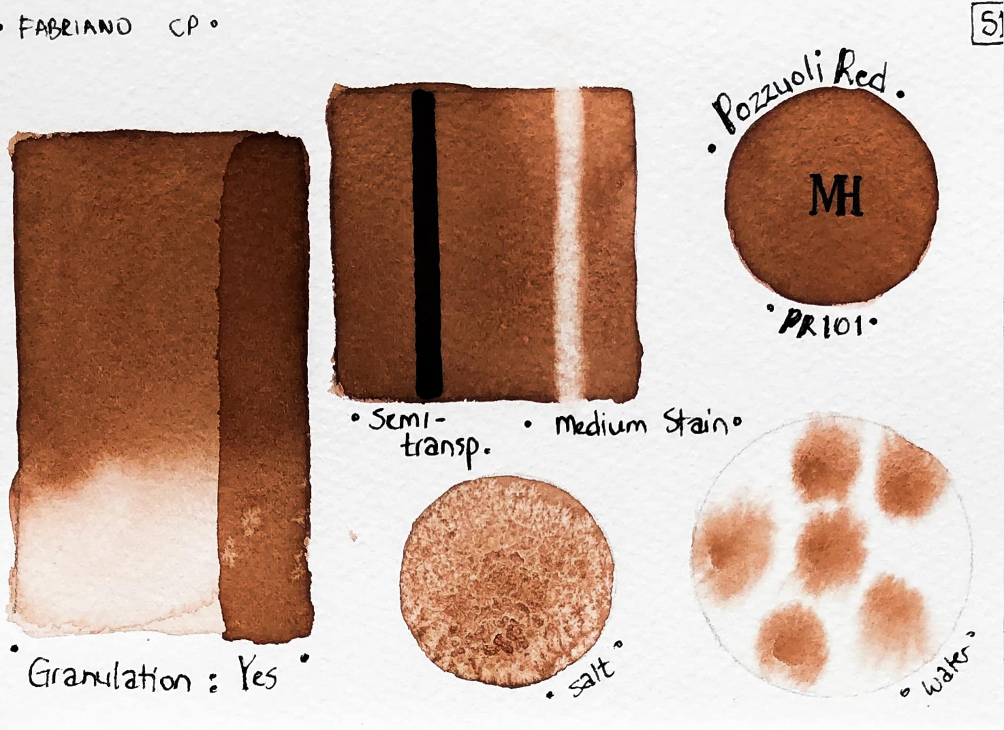
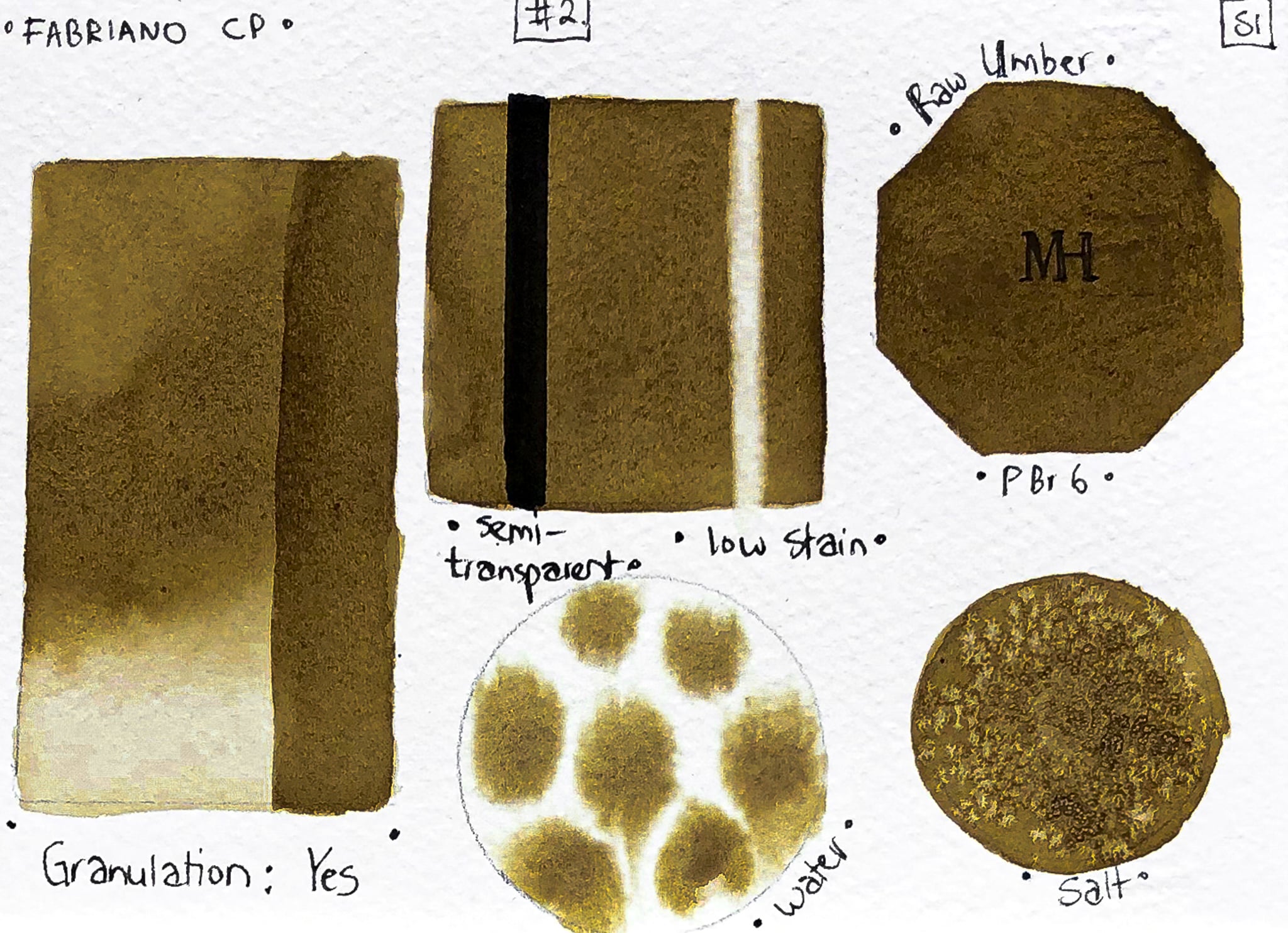
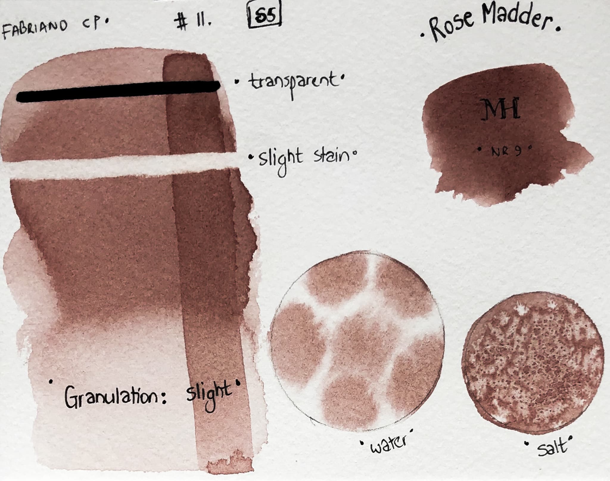
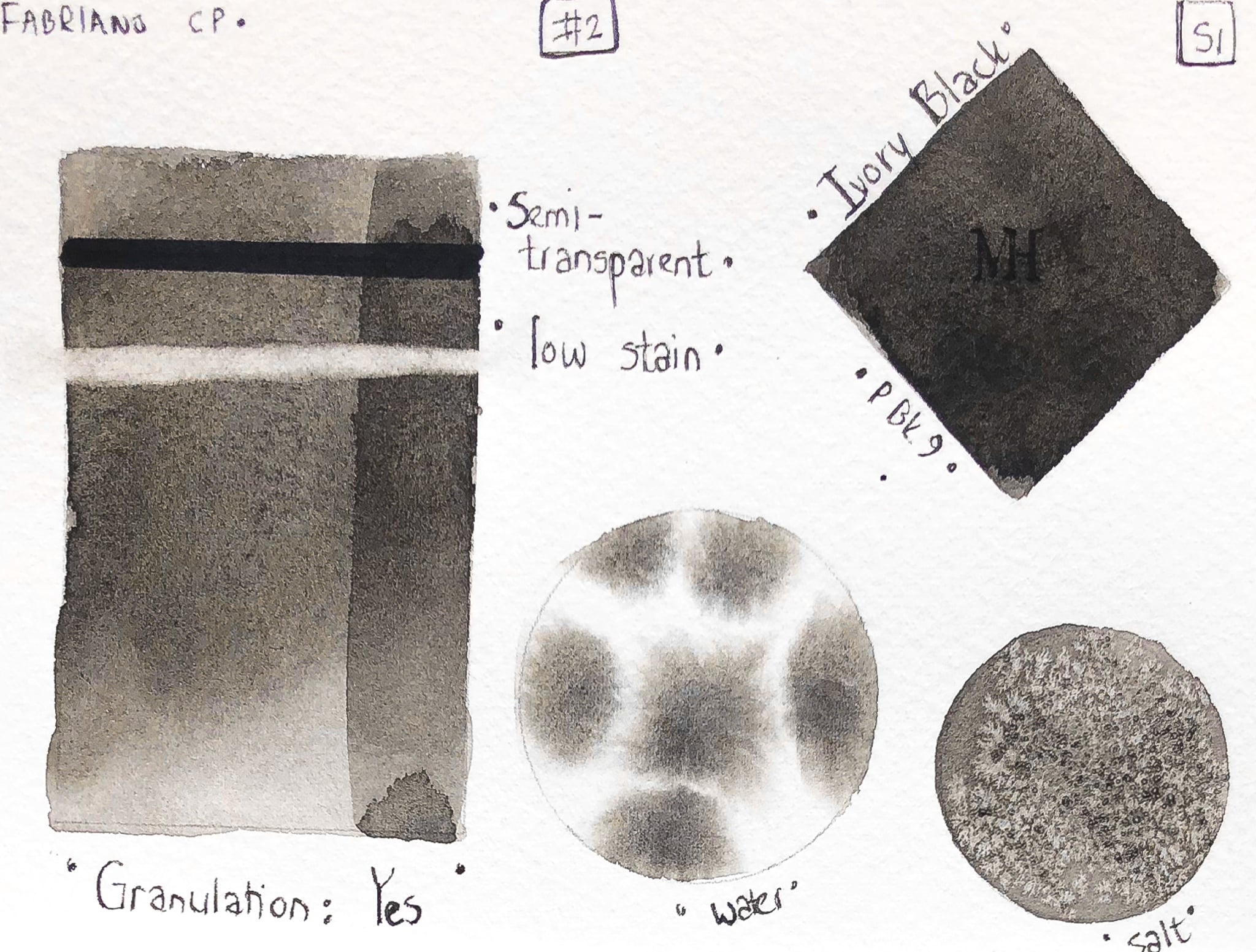
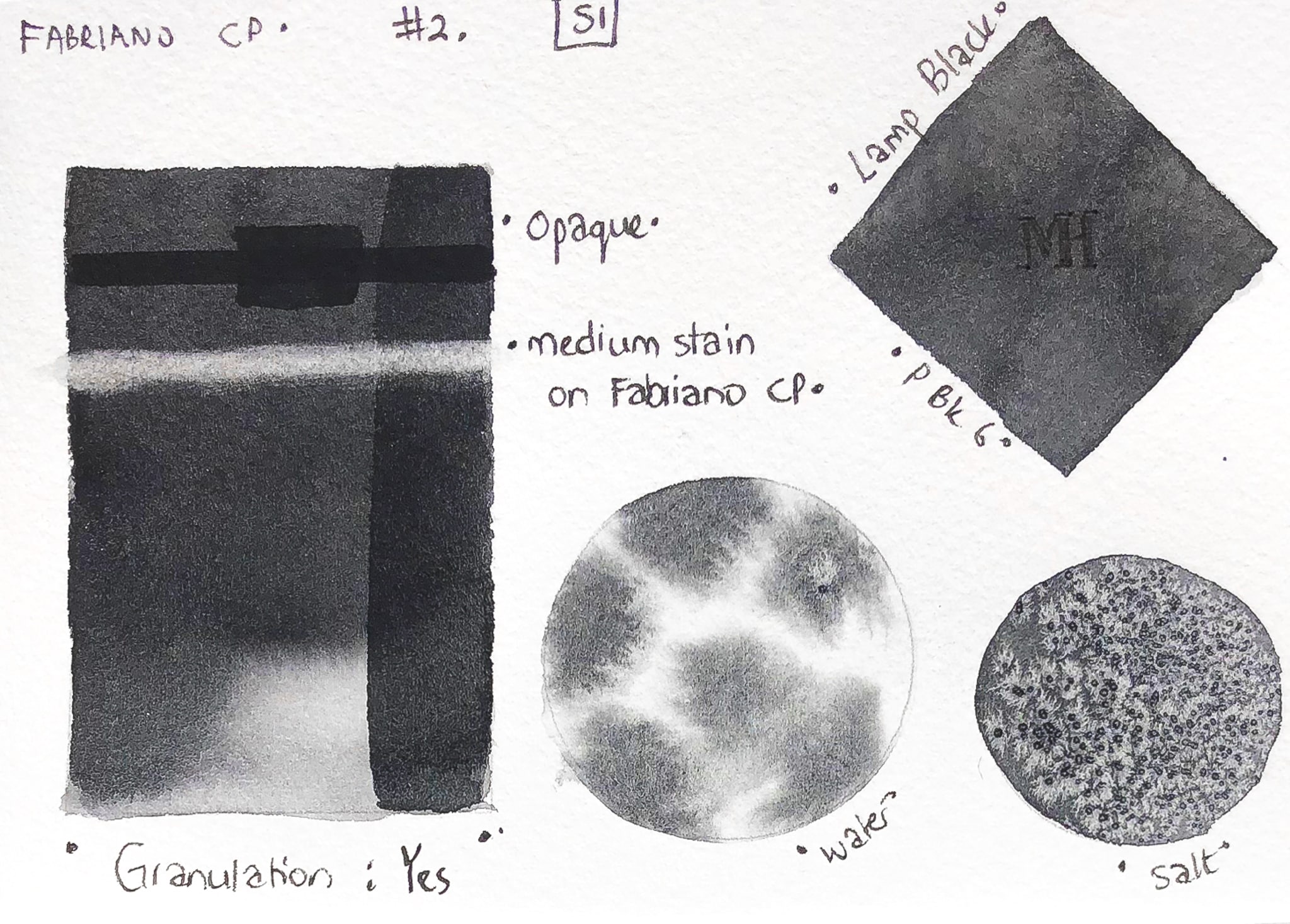
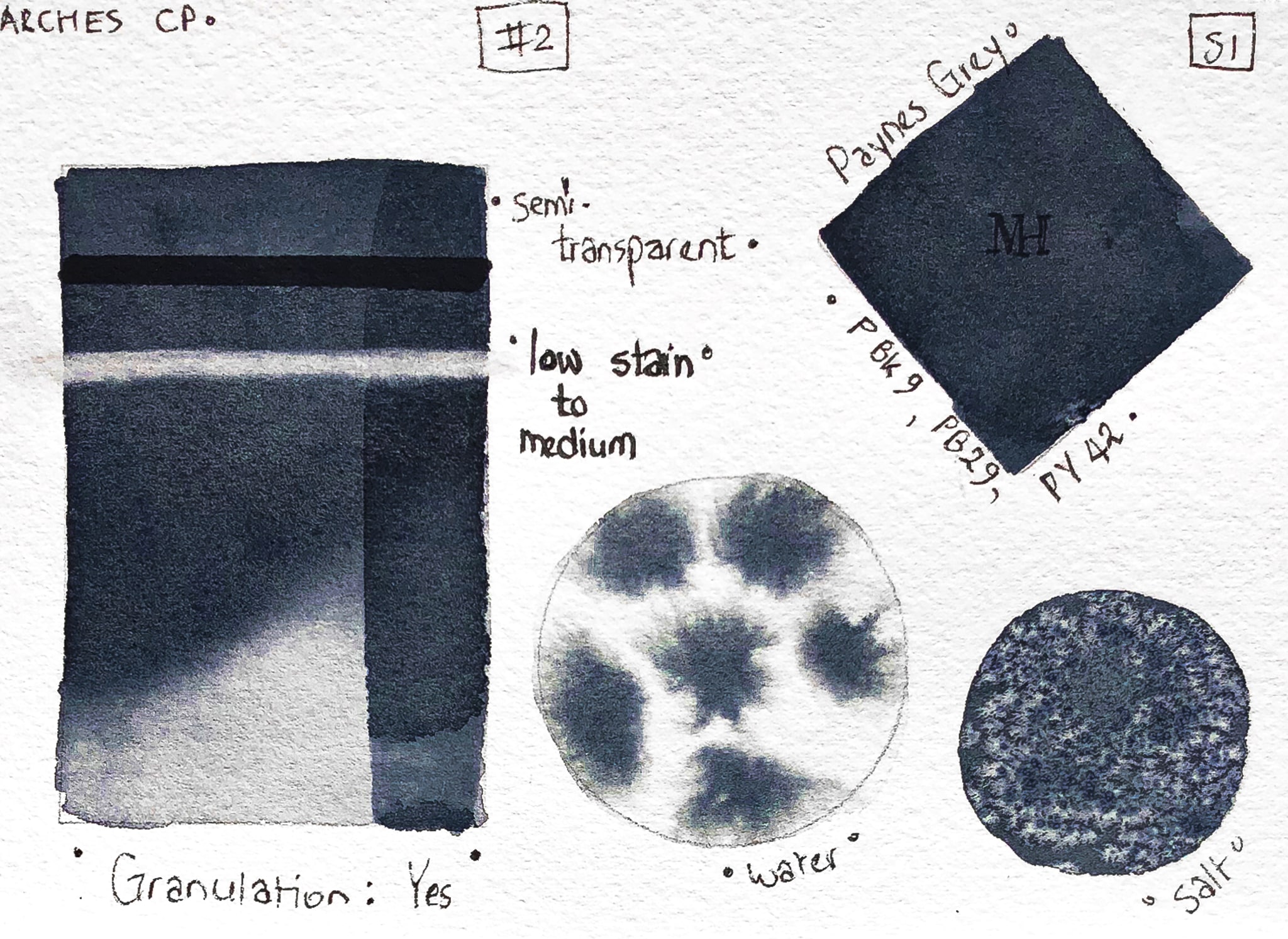
Currently, 138 colours available in the range. All swatch tests done consistently as possible. Paints tested on Fabriano Artistico, cold pressed and hot pressed, and Arches HP and CP.
General observations, paints are highly pigmented, finely milled, and unique, in that they can appear similar to ink in their intensity of colour. Definitely not filled with any unwanted extras. One of my first impressions laying them down on paper – these paints are made with care.
This range of quality watercolours benefits from being mixed on a ceramic palette or in ceramic dishes, in order to pre-mix the amount you need with water and to get used to the paint to water ratio. For most of these colours, a little goes a long way.
If you are an artist who tends to go back and retouch and fiddle, be careful not to overwork areas, or be too heavy-handed.
I started this painting on Fabriano CP, delighted with the intensity of the colours, only to realise I had quickly lost my white areas. I then started to lift here and there, and the results were satisfactory, but due to some staining, I could not completely restore the white of the paper. It helps to know which colours stain, if you want to be able to lift and lighten areas.
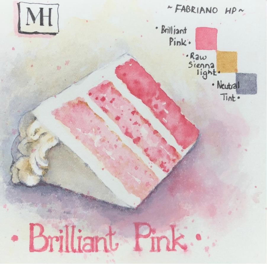
Next I painted on Fabriano hot pressed paper. I found the colour got sucked into the fibres rather quickly and got saturated with water. I thought I was painting on the wrong side, but no, I double-checked. Faulty sheet perhaps? I enjoyed the colours used. Brilliant Pink is one of the colours that contain white, and I can see it being used in illustrations.
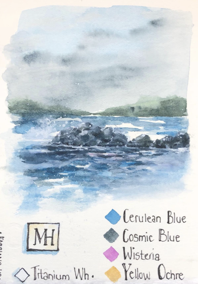
I decided to test on another sheet of Fabriano HP and did a rough painting. Yes, the sizing was much better on this sheet! I was able to paint a soft sky. I also enjoyed seeing the lovely shade of green that came from mixing Cosmic Blue with Yellow Ochre.
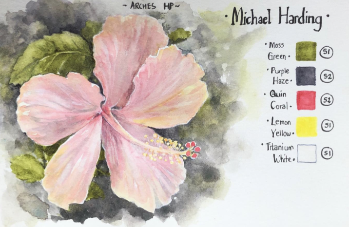
Arches HP was much easier for me to paint on. Although you can glaze colours, still, be careful not to overwork – build carefully from light to dark, if painting detailed objects, animals or botanicals.
I so enjoyed the Moss Green, Quin Coral and Purple Haze. The Michael Harding range of colours are beautiful and also, I found, true to what they are originally meant to be. Many of the colours have the quality of ranging from very dark, to also very light. And a few unusual colours that will surprise you as you paint with them, producing lovely pigment separation effects on the palette and paper. (Forest Green was one of these)
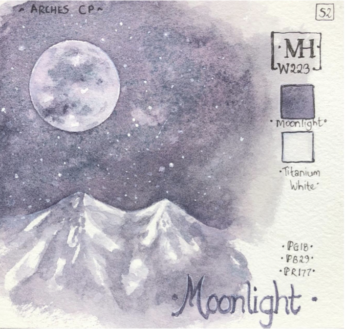
A favourite of mine is Moonlight, with its colour separation and distinct granulation. (I only used Titanium White for the stars and slight highlights on the Moon).
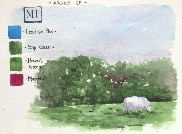
In this next painting, I used Magenta and Cerulean Blue in a light wash for the sky. I watered down the greens at first, then layered, and also added a little Magenta to the shrub area.
The Michael Harding range also has a variety of earth tones to choose from, and quite a few of natural earth origin. In addition to Chinese White and Titanium White, there are 12 other colours in the range that contain white, giving extra colour variety.
I am looking forward to experimenting some more with these paints!